Copyright © 2016 - 2021, The Troy Press

Copyright © 2016 - 2021, The Troy Press
Copyright © 2016 - 2021,
The Troy Press
This page is a part of our broader Covid-19 coverage:
We invite you to contact us and tell us what you think, and ask questions - what do you want to know that the media isn't telling you? We genuinely want to answer all good questions if we can. You can mail us, use our comment section on the main Covid-19 page. And as we are an all-volunteer team, if you want, you can make a donation.
Texas's "Stay-at-home" began March 19, and ended April 30.
On May 5, they announced a reopening of certain businesses starting May 8. Salons were allowed to open May 8, with restrictions such as one customer per stylist and 6 feet between stations and customers waiting. Masks are strongly recommended by not mandatory. Gyms and exercise facilities, non-essential manufacturing and business offices will be allowed to reopen May 18, with restrictions such as keeping capacity at 25% and ensuring social distancing. All retail stores, restaurants, movie theaters, malls, museums, and libraries were permitted to reopen on Friday, May 1, but must limit their capacity to 25% of their listed occupancy.
Hand-Made Graph At Right
Click here for
full size.
Click herefor
the Automated version.
Click here for
the data in
csv format.
Hand-Made in
full size.
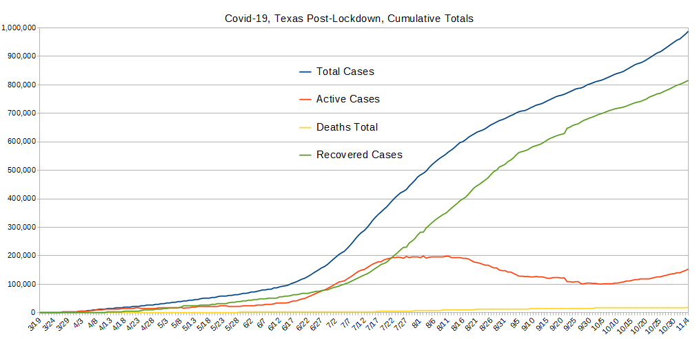
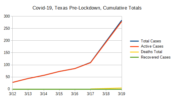
The only of these to ever drop is the number of active cases, which is bound to go down some day. So, other than active cases, it's the rate of change that's important. Most of our other graphs are focused on showing you these changes in the right scale since here, any squiggle from one day to the next is pretty well lost to the eye.
After having analyzed a good handful of U.S. State's data now, at first blush, Texas' experience is remarkably good. Active Cases separates away from Total Cases relatively early and continues to diverge in ways not seen elsewhere. Further, Recovered Cases begin to rise far more early than elsewhere, and are truly remarkable.
Given this unique situation - that is, given this unique response to the SARS-CoV-2 virus's presence as compared with others, and given how good it looks - one would be a fool not to question if this data has been baked somehow by authorities? Hmmm. We have no evidence of that, but we're reminded of the old saying, "if it looks too good to be true, it probably is." And this is Texas we're talking about.
Insofar as this is genuine, it's truly remarkable.
Hand-Made Graph At Right
Click here for
full size.
Click herefor
the Automated version.
Click here for
the data in
csv format.
Hand-Made in
full size.
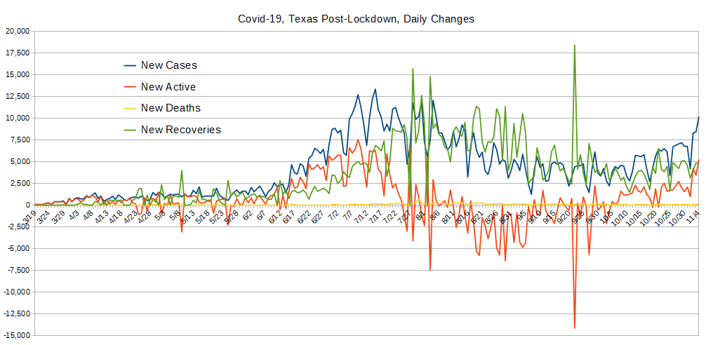
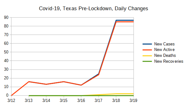
These data were created by taking the daily values for the data used to create the Totals graph above, and comparing with the previous day's value and computing the difference. New Cases and Newly Active cases closely match most of the time and this is because testing is nearly exclusively being done on those people who present themselves for health care. (And, folks, this is definitely "doing it wrong.") However, when people recover (or die), that also has an impact on the daily changes to the number of active cases, and therefore the change from one day to the next which drives how these data are collected.
The data on this graph looks like a healthy health-care system doing a good job without being overwhelmed. There are a lot more strong "recovery" days that overwhelm new cases than other States, and the overall demand on the system is relatively modest.
In sum, Texas' experience is better than most states we've analyzed.
Hand-Made Graph At Right
Click here for
full size.
Click herefor
the Automated version.
Click here for
the data in
csv format.
Hand-Made in
full size.
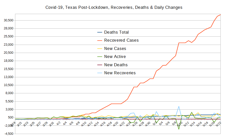
The purpose of this graph is to show two values also shown on the "Totals" graph above with much better scaling. These are the total deaths and the total recovered cases.
Notably, the big negative spike for Active Cases being precisely timed with the big spike in recoveries illustrates the point made above about "New Active" really meaning "new changes to the currently active cases," and so it can go negative as it does here when there's a larger number of recoveries (and deaths) than new infections.
The "New" lines are all shown with better scaling in the graph above, and are included here for better comparison with total recoveries and deaths.
Hand-Made Graph At Right
Click here for
full size.
Click herefor
the Automated version.
Click here for
the data in
csv format.
Graphed "By-Hand".
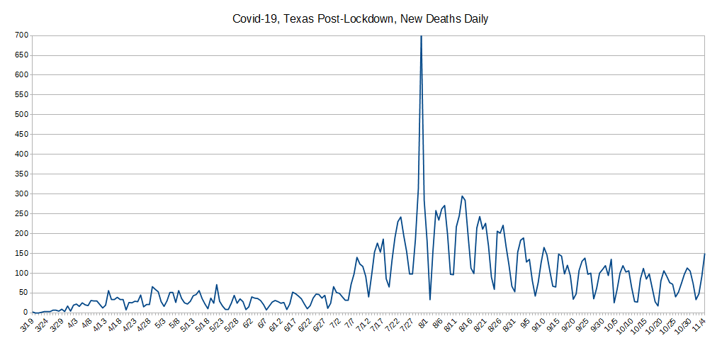
This was broken out, again, for better scaling because the variation is simply lost at other scales.
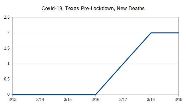
As seen in most states, there's an absense of reporting deaths on Sundays by some health-care providers, and that's just where all the down-spikes are.
Deaths rose modestly through to around April 10, and since have been sporatic but roughtly flat, maybe with a modest increase over time. But the numbers are still overall reasonably low.
Oddly, unlike most states, while Texas does have sharp down-spikes in reporting, it looks like they are not confined to Sundays as elsewhere but also include many Mondays!
Hand-Made Graph At Right
Click here for
full size.
Click herefor
the Automated version.
Click here for
the data in
csv format.
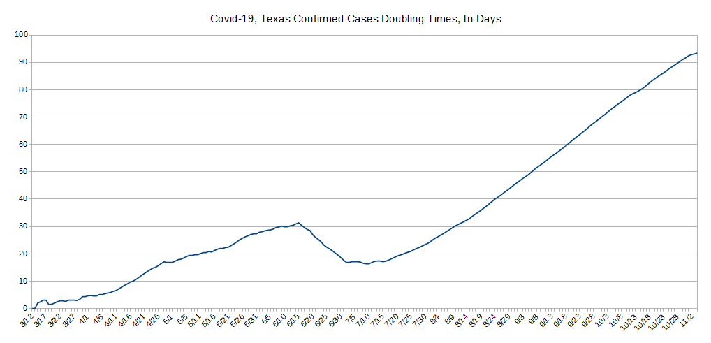
The concept behind "Case Doublings" is to try and get a handle on whether one is winning the war against a pandemic or not. It's driven by how many cases of confirmed infection are recorded. It's simple: From today, looking to the past, how long has it been since we had half as many cases as we have today? That is, today represents a doubling from what day in the past?
One can also look at it in a forward direction but the information isn't as useful beacuse it jumps around lot due to subtle variations in the day-to-day number of reported cases. And, that also tends to obscure the scale. In contrast, looking backwards always gives a stable line because the daily variations shown and discussed above aren't present.
The longer it takes for the number of cases to double, the better you're doing against the pandemic, and the CHANGE in the number of days indicates whether your current actions are helping or hurting. We also think a pertinent timescale is the average time of an infected person's disease to run its course to either recovery or death, presently believed to be about 21 days.
A significant part of why Texas is doing so well is likely the timing of their Stay-At-Home order, as shown by the data here. The day before, they were headed for VERY short doubling times, but, as with most states, the Stay-At-Home order did stop the steep rise in new cases. However, they weren't off to a steep rise in doubling times as with most other states.
It seems at first Texans weren't all that keen on adhering to their Stay-At-Home order but things got better on April 11th, only to backslide significantly on April 27. Maybe a Texan can fill us in on why things changed at that time, but ever since the rise in doubling times has been decreasing for the worse.
As things stand now, Texas isn't beating even the best estimates of case-resolution timeframes with their doubling numbers, so their health-care facilities are likely still filling, though they've done WAY better than most at getting patients recovered and out of their facilities. 23 days is NOT a good doubling number as it means they'll have double their current cases in about three weeks. Sure, they're pumping them out of their health-care system quickly, but that's one heck of a way to build herd immunity - we guess Texans would know about that!
Do let us know what you think or even make requests or ask questions! Please either comment on our main Covid-19 page's comment section, email us, or perhaps, as we're an all volunteer team, donate to our cause.