Copyright © 2016 - 2023, The Troy Press

Copyright © 2016 - 2023, The Troy Press
Copyright © 2016 - 2023,
The Troy Press
Chief among the several reasons we created these graphs and are providing this daily update is concern over lifting the lockdown early because people don't understand the positive impact it's having. These charts prove the lockdown is saving lives. And, other work we've done can show what would happen if we lifted the lockdown now - more on that below.
We invite you to contact us and tell us what you think, and ask questions - what do you want to know that the media isn't telling you? We genuinely want to answer all good questions if we can. There's a comment section below, you can mail us and, if you want, you can make a donation.
(We fixed the glitch in our automation engine!)
First things first: Let's address the most pressing issue...
Yes! First, lets look at the daily numbers of new cases, new active cases, new deaths and, best of all, new recoveries:
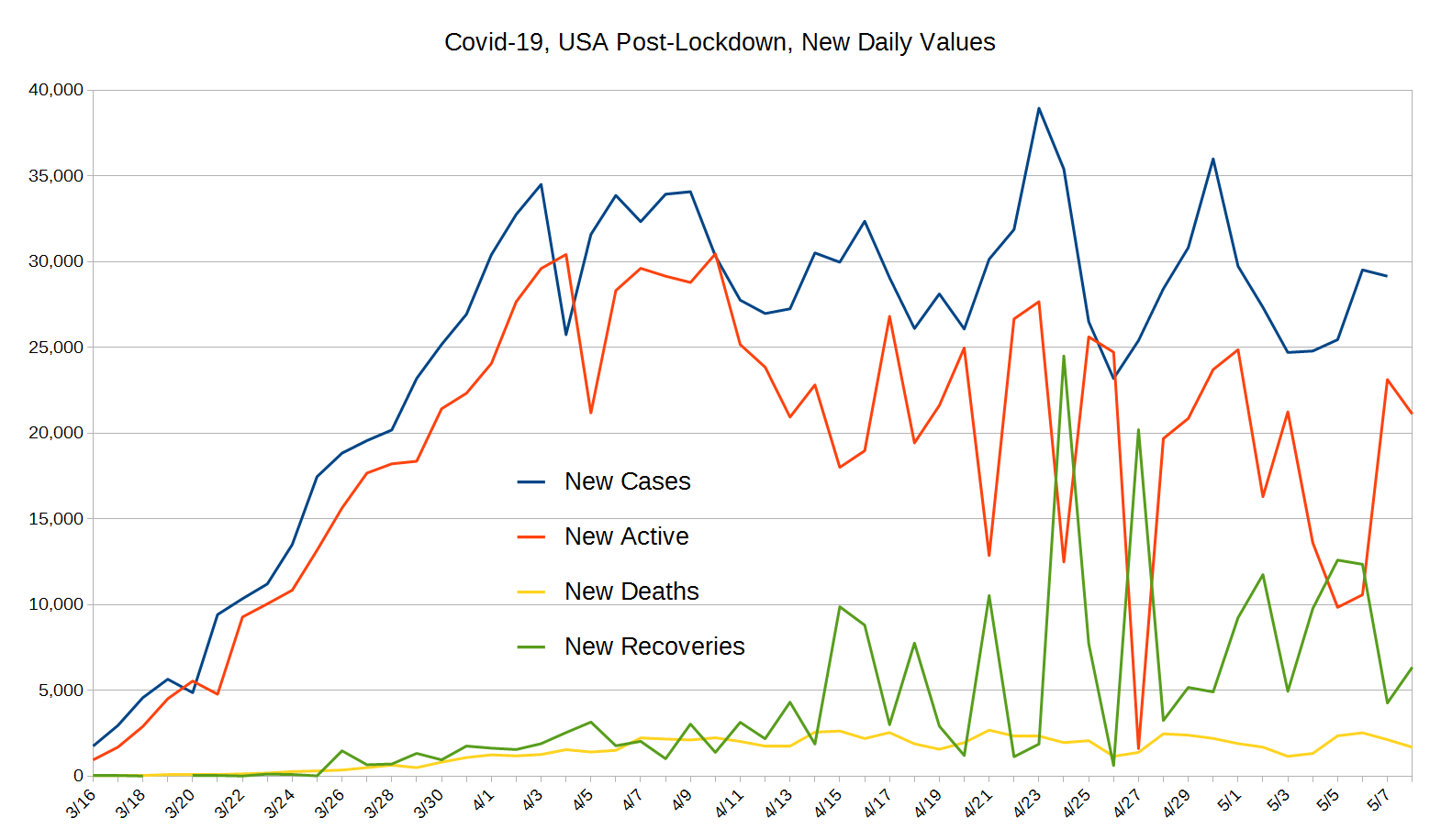
Note how the blue line climbs steeply up from near zero, then suddenly peaks on April 2, and then, while jumping up and down a lot since then, is more or less flat. The computed average is just barely above 30,000 from April 2 to May 2. And this is great news because we're finally starting to test people who weren't seeking treatment.
Worth noting also is how changes in active cases parallels fairly closely new daily cases about two days later, reflecting the time from testing to the infected being in a hospital setting. From there, testing of the general population - not just those seeking medical attention - starts to kick in and we see the new-active cases dropping. This means we've likely hit the peak, but we won't really know until it's well past us.
A key metric that really shows that lockdown is working is how the daily count of newly active cases pretty much exactly matches the new confirmed cases, just two days later, right as lockdown started and as time went on, the new active cases starts dropping and getting spread further in time, and it also starts diverging downward in early April.
New cases, while jumping up and down with bing swings, have been relatively flat (on average) since about April 2. In sharp contrast active cases has been dropping steadily. Of course, when people either die or recover, they're no longer active, and while daily new deaths are remaining fairly stable since the end of the first week in April, recoveries are going up, and when they do, the daily number of active cases drops in an exactly one-for-one relationship, which is why the orange and green lines often mirror each other (the reverse of one another).
We invite you to contact us and tell us what you think. Most of our web pages have a comment section below.
... We haven't added the comment section yet, but we will soon!