Copyright © 2016 -2026, The Troy Press

Copyright © 2016 -2026, The Troy Press
Copyright © 2016 -2026,
The Troy Press
This page is a part of our broader Covid-19 coverage:
We invite you to contact us and tell us what you think, and ask questions - what do you want to know that the media isn't telling you? We genuinely want to answer all good questions if we can. You can mail us, use our comment section on the main Covid-19 page. And as we are an all-volunteer team, if you want, you can make a donation.
California's "Shelter-In-Place began on March 16 as the 6 San Francisco Bay Area counties decided to place an order. The governor then had the state follow suit a week later.
In recent times, the rules are changing as the state is trying to come to terms with "a new normal."
Hand-Made Graph At Right
Click here for
full size.
Click herefor
the Automated version.
Click here for
the data in
csv format.
Hand-Made in
full size.
Since Lockdown Started
All of it.
The only of these to ever drop is the number of active cases, which is bound to go down some day. So, other than active cases, it's the rate of change that's important. Most of our other graphs are focused on showing you these changes in the right scale since here, any squiggle from one day to the next is pretty well lost to the eye.

Given CA's population, the total infections aren't bad, but the trend of the line is troubling - curving higher and showing no sign of peaking / flatening. Also worrisome is the separation between Total Cases and Active Cases; isn't nearly as good as we'd like to see and this is, of course, because recoveries haven't been strong, as can be seen in this data.
The lack of flattening that can be seen in Case Totals here is supporeted in the Doubling Times, found in the bottom graph on this page.
Hand-Made Graph At Right
Click here for
full size.
Click herefor
the Automated version.
Click here for
the data in
csv format.
Hand-Made in
full size.
Since Lockdown Started
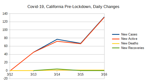
Pre-Lockdown
All of it.
These data were created by taking the daily values for the data used to create the Totals graph above, and comparing with the previous day's value and computing the difference. New Cases and Newly Active cases closely match most of the time and this is because testing is nearly exclusively being done on those people who present themselves for health care. (And, folks, this is definitely "doing it wrong.") However, when people recover (or die), that also has an impact on the daily changes to the number of active cases, and therefore the change from one day to the next which drives how these data are collected.

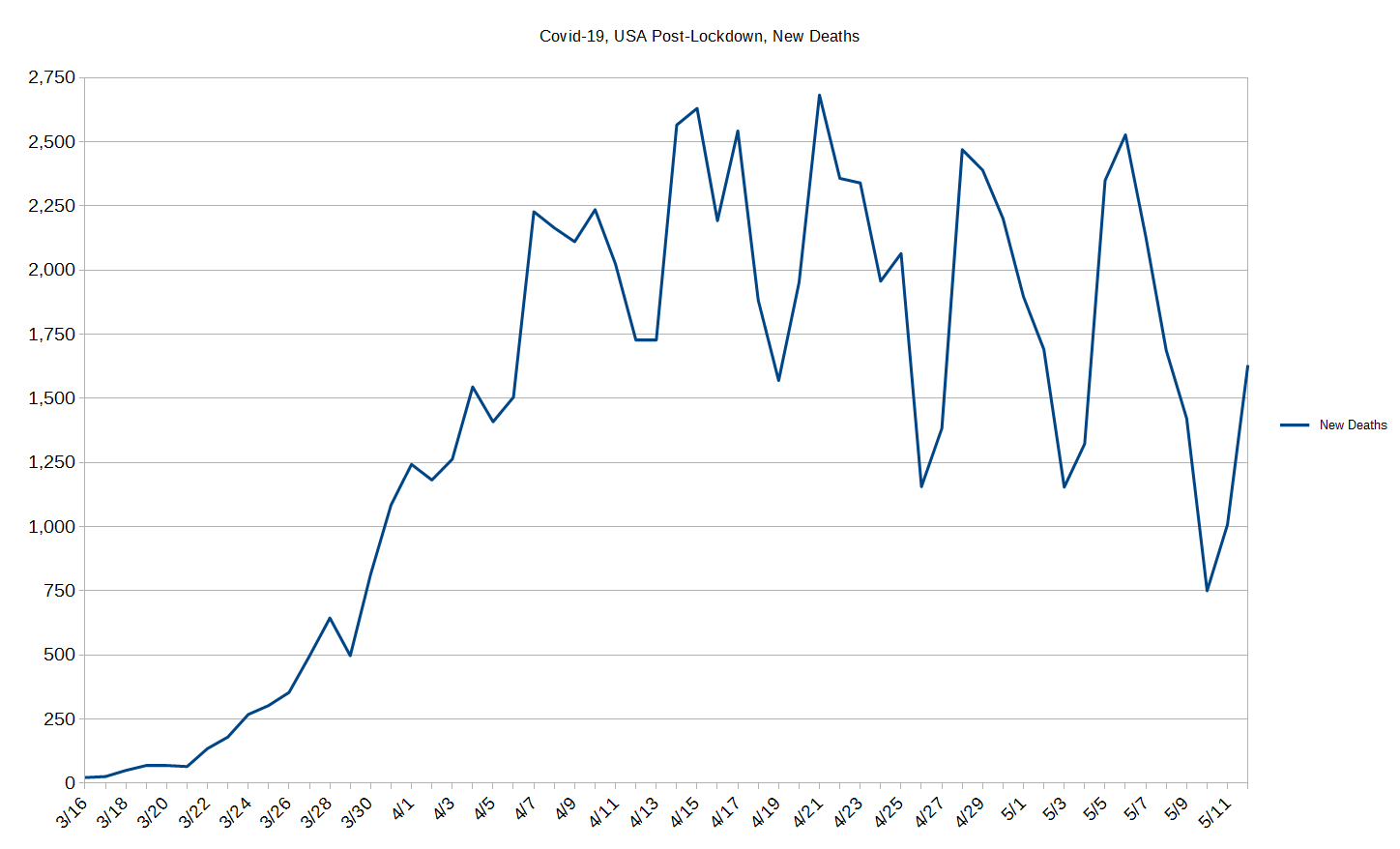
When we first saw this graph, we were impressed as it showed the Lockdown was having the desired effect and had halted the sharp rise in cases. When we checked again, we were hopeful as things virtually all the lines were trending downward. But by the third week in May, that had all changed and since then things have been getting worse.
The huge negative spike in newly active cases along with a big spike in recoveries was a VERY notable occurance. The USA as a whole experienced a similar thing around May 12 while this was earlier. This is the kind of thing we're hoping to see in the numbers everwhere and a lot more frequently. And, indeed, we DO see that in some states, but it's too infrequent in California.
Hand-Made Graph At Right
Click here for
full size.
Click herefor
the Automated version.
Click here for
the data in
csv format.
Hand-Made in
full size.
Since Lockdown Started
Pre-Lockdown
All of it.
The purpose of this graph is to show two values also shown on the "Totals" graph above with much better scaling. These are the total deaths and the total recovered cases.

The recovered cases line is basically horizontal for a while because of how long people are sick before recovering; it takes a while before there are significant numbers of people recovering, which we see begin to happen in big numbers around May 4.
The "New" lines are all shown with better scaling in the graph above, and are included here for better comparison with total recoveries and deaths.
Hand-Made Graph At Right
Click here for
full size.
Click herefor
the Automated version.
Click here for
the data in
csv format.
The number was too small to warrant graphing.
Since Lockdown Started
Pre-Lockdown
All of it.
This was broken out, again, for better scaling because the variation is simply lost at other scales.
This graph illustrates when the positive effects of lockdown kicked in and instead of continuing to rise as it was through the second half of March and first half of April, it basically flattens out considerably starting in mid April. Notably, this graph has a very different curve to it than the one for the whole USA.
One interesting thing to observe here are the sharp down-peaks to a pretty consistent value. The down values represent health-care organizations that don't report on Sundays! And the consistency of that gives a good idea regarding how many don't report on Sundays!

When we first made this graph, we were delighted to see that the lockdown appeared to have blunted the then unrelenting rise in deaths. Since then, however, the death rate went flat, and has even risen a little. Note how the bottoms of the low-peaks (troughs) are all around 30, but since late April the high peaks are trending upward somewhat.
Given how many cases there are outstanding, these numbers aren't crazy bad, especially when compared with New York, but we're concerned about the trend.
As noted with other graphs here, this is supported by the down-turn in the doubling-times curve. CA isn't quite getting it right, and, again, we are concerned.
As an exercise for the curious, grab the CSV data file we provide and point it to your favorite "calc" program like, Microsoft Office's Excel, or "Calc" in OpenOffice, or, our favorite, Libre-Office Calc, and pick a start date, select the columns and have it calculate a sum for these. Then divide that number by how many days you've selected and you can easily compute the average over any period you wish, and thereby get rid of those pesky peaks and valleys for any period you choose. ... It has been suggested we do a "rolling week" average - or something like it - but before we do the work, we'd like to hear if here's significant interest in that, and if so, for which data sets.
Hand-Made Graph At Right
Click here for
full size.
Click herefor
the Automated version.
Click here for
the data in
csv format.
The concept behind "Case Doublings" is to try and get a handle on whether one is winning the war against a pandemic or not. It's driven by how many cases of confirmed infection are recorded. It's simple: From today, looking to the past, how long has it been since we had half as many cases as we have today? That is, today represents a doubling from what day in the past?
One can also look at it in a forward direction but the information isn't as useful beacuse it jumps around lot due to subtle variations in the day-to-day number of reported cases. And, that also tends to obscure the scale. In contrast, looking backwards always gives a stable line because the daily variations shown and discussed above aren't present.
The longer it takes for the number of cases to double, the better you're doing against the pandemic, and the CHANGE in the number of days indicates whether your current actions are helping or hurting. We also think a pertinent timescale is the average time of an infected person's disease to run its course to either recovery or death, presently believed to be at least 21 days.

This graph shows that California made a poor start on the lock-down order, only really starting to even try by March 28, 12 days after the start, and since then, the state's success has wavered quite a bit more than many other states.
Present actually experienced doubling-times are below a month, and this is troubling. Overall, doubling times are WAY better than when lockdown started, but need to go higher. Can we say California's health-care systems can handle a doubling in the next month? The future-looking projections look good, but the actual results need improvement. Consider that some states have over 40 day doubling times, What's wrong, California?
Do let us know what you think or even make requests or ask questions! Please either comment on our main Covid-19 page's comment section, email us, or perhaps, as we're an all volunteer team, donate to our cause.