Copyright © 2016 - 2025, The Troy Press

Copyright © 2016 - 2025, The Troy Press
Copyright © 2016 - 2025,
The Troy Press
This page is a part of our broader Covid-19 coverage:
We invite you to contact us and tell us what you think, and ask questions - what do you want to know that the media isn't telling you? We genuinely want to answer all good questions if we can. You can mail us, use our comment section on the main Covid-19 page. And as we are an all-volunteer team, if you want, you can make a donation.
The data indicates that surely, Louisiana has done better than most U.S. states, though that's not to say they did or are doing things perfectly. Clearly the state took the risk seriously and has kept one of the best track records of U.S. states during this pandemic.
Louisiana's "Stay-At-Home" began on March 23 and ended May 15. We think this was surely a mistake. Deaths bottomed out at zero on May 25 and have been rising since and the doubling time curve has started to fall off, indicating trouble.
In recent times, the rules are changing as the state is trying to come to terms with "a new normal."
Hand-Made Graph At Right
Click here for
full size.
Click herefor
the Automated version.
Click here for
the data in
csv format.
Hand-Made in
full size.
Since Lockdown Started
All of it.
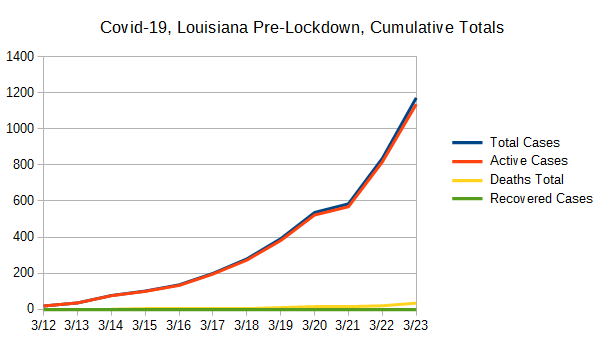
The only of these to ever drop is the number of active cases, which is bound to go down some day. So, other than active cases, it's the rate of change that's important. Most of our other graphs are focused on showing you these changes in the right scale since here, any squiggle from one day to the next is pretty well lost to the eye.
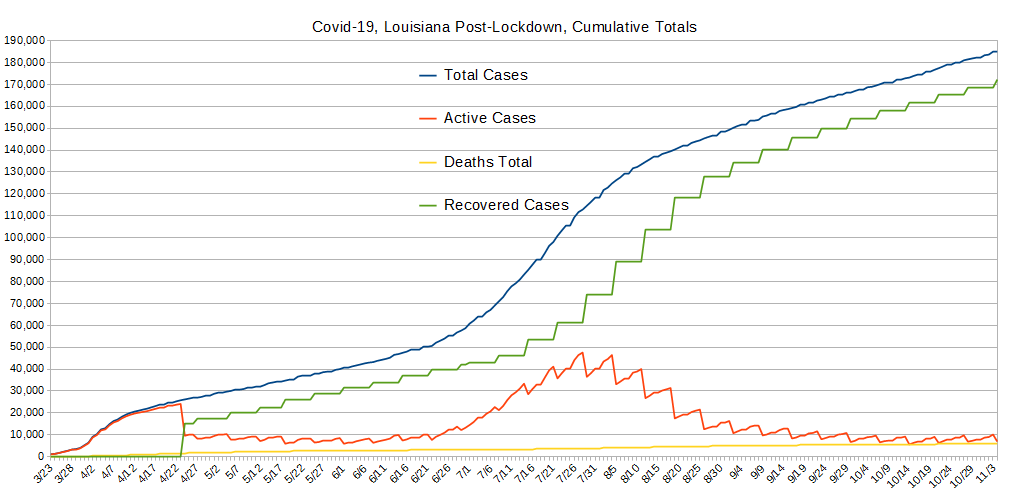
The data supports the conclusion Louisiana is doing better than most states. Its recoveries are keeping apace with total cases and it is gently driving active cases toward zero. Good job, Louisiana. That said, new cases continue to arrive and keep the system from clearing its decks completely. And, unfortunately, as of this writing (June 6), the data is showing signs of possibly going very much for the worse. Hold it together, Louisiana!
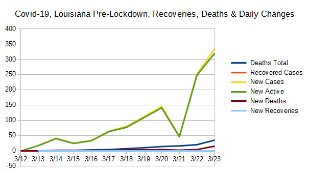
Given the steps in the data, it's a pretty sure bet the HUGE change on April 24 was due to the bureaucracy getting its act together regarding reporting - from zero to 15,000, overnight? Really? Whatever happened, it's a welcome change, though given what we've seen in other states, it appears that health-care providers were ordered not to do any reporting and let the state do it.
It also appears as though there was a command given a few days later to begin regular reporting, and on April 27, LA begins a pattern of reporting about once a week, varying by a day or so here and there.
This illustrates to this analyist, Louisiana's health-care institutions are NOT doing the reporting but some governmental bureaucracy. Pity. But overall, it's a success.
Hand-Made Graph At Right
Click here for
full size.
Click herefor
the Automated version.
Click here for
the data in
csv format.
Hand-Made in
full size.
Since Lockdown Started
Pre-Lockdown
All of it.
These data were created by taking the daily values for the data used to create the Totals graph above, and comparing with the previous day's value and computing the difference. New Cases and Newly Active cases closely match most of the time and this is because testing is nearly exclusively being done on those people who present themselves for health care. (And, folks, this is definitely "doing it wrong.") However, when people recover (or die), that also has an impact on the daily changes to the number of active cases, and therefore the change from one day to the next which drives how these data are collected.
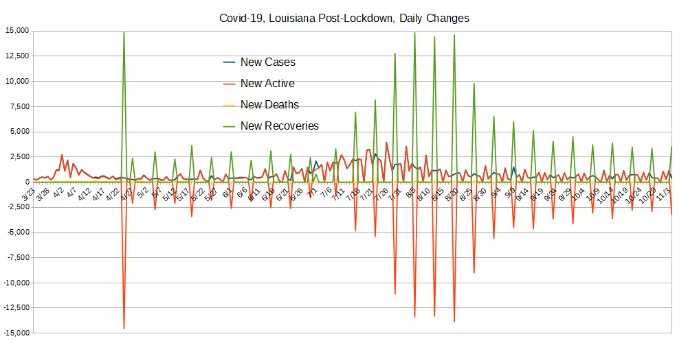
Unfortunately, Louisiana's reporting stragegy makes this graph close to useless. That's what buraucracies do when they want to try and hide things they're worried about. This is not how transparent democracy is done, guys. If you want to see a state that's done it much closer to correctly, try CA.
The huge negative spike in newly active cases along with a big spike in recoveries was a VERY notable occurance. The USA as a whole experienced a similar thing around May 12 while this was earlier. This is the kind of thing we're hoping to see in the numbers everwhere and a lot more frequently, but in Louisiana's case, it's just noise.
And, the weekly negative orange spikes with the green positive ones are, of course, also a result of the reporting strategy. ...Perhaps we should re-do this graph with min and max values that allow us to see the detail of the other lines on the chart? Please let us know if you think so. If it would be appreciated, we can do it.
Hand-Made Graph At Right
Click here for
full size.
Click here
for the Automated version.
Click here for
the data in
csv format.
Hand-Made in
full size.
Since Lockdown Started
Pre-Lockdown
All of it.
The purpose of this graph is to show two values also shown on the "Totals" graph above but with much better scaling. These are the total deaths and the total recovered cases. We added in the daily changes to help us with context of what else was going on at the time.
The "New" lines are all shown with better scaling in the graph above, and are included here for better comparison with total recoveries and deaths.
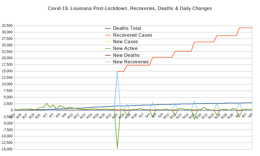
The recovered cases line is basically horizontal for a while because of how long people are sick before recovering; it takes a while before there are significant numbers of people recovering, which we see begin to happen in big numbers around May 4.
Hand-Made Graph At Right
Click here for
full size.
Click herefor
the Automated version.
Click here for
the data in
csv format.
The number was too small to warrant graphing.
Since Lockdown Started
Pre-Lockdown
All of it.
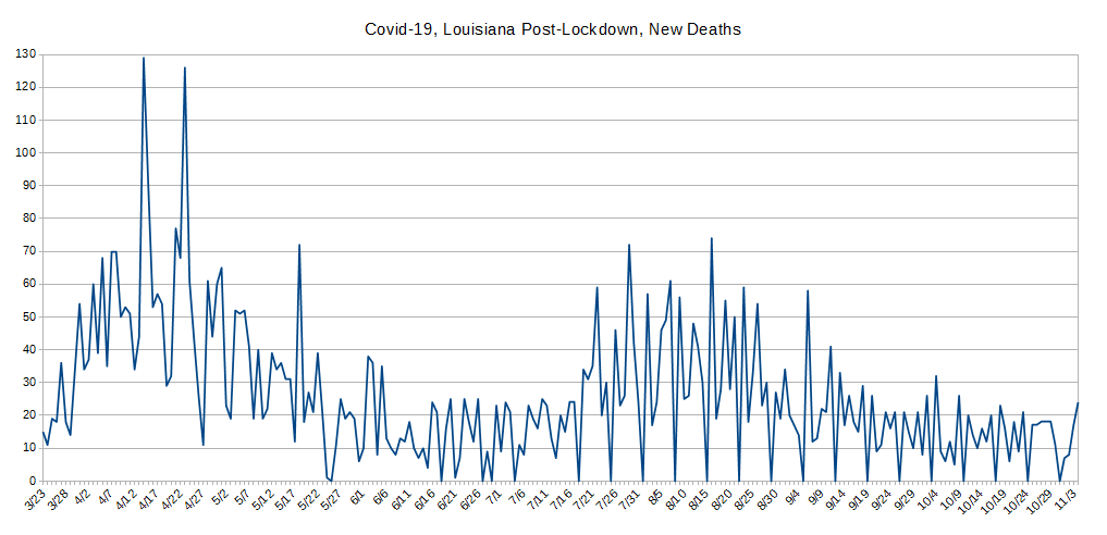
This was broken out, again, for better scaling because the variation is simply lost at other scales.
Here, we see it proven that lockdown works at saving lives.
This graph illustrates that when lockdown's effects kicked in, instead of continuing to rise as it was through the second half of March and first half of April, things peaked in the third week of April and have been gengly descending since then. AGAIN, this is a welcome surprise! Good Job Louisiana! ... Notably, this graph isn't all that different to the one for the whole USA.
One interesting thing to observe here are the sharp down-peaks. These down values represent health-care organizations that don't report on Sundays!
Hand-Made Graph At Right
Click here for
full size.
Click herefor
the Automated version.
Click here for
the data in
csv format.
The concept behind "Case Doublings" is to try and get a handle on whether one is winning the war against a pandemic or not. It's driven by how many cases of confirmed infection are recorded. It's simple: From today, looking to the past, how long has it been since we had half as many cases as we have today? That is, today represents a doubling from what day in the past?
One can also look at it in a forward direction but the information isn't as useful beacuse it jumps around lot due to subtle variations in the day-to-day number of reported cases. And, that also tends to obscure the scale. In contrast, looking backwards always gives a stable line because the daily variations shown and discussed above aren't present.
The longer it takes for the number of cases to double, the better you're doing against the pandemic, and the CHANGE in the number of days indicates whether your current actions are helping or hurting. We also think a pertinent timescale is the average time of an infected person's disease to run its course to either recovery or death, presently believed to be at least 21 days.
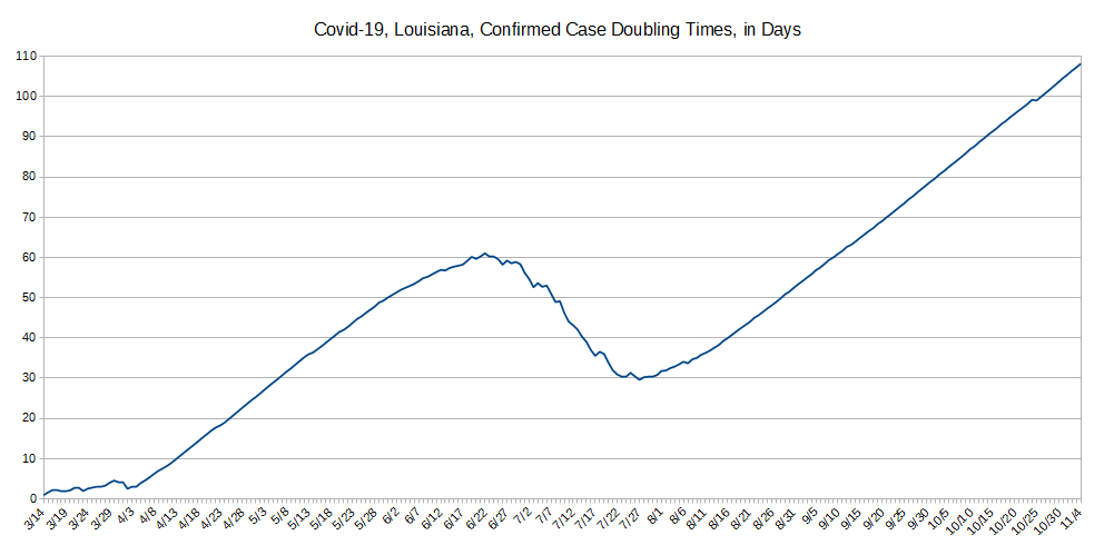
First, the good news: Once again, Louisiana Surprises! It's case doubling time, looking to the actual experience of the past, is 44 days as of this writing, and that's a full third better than California for, example! Still, is Louisiana ready for double the cases in 42 days? Maybe.
Now, Louisiana's initial reaction to the virus and lockdown can easily be seen in the early doubling data. Up to March 16, there was a good line, but then back-sliding, a little better, then back-sliding, and a third time. Then, finally, on May 2, Louisiana started to get its act together and mostly keep on the straight-and narrow, finally taking this virus seriously. There are four wavers in the data which likely represent some specific events in the state that resulted in enough people getting sick to perturb this line, but thankfully, it wasn't too many people. Our guess would be religious services where people think god will protect them.
The reason the present 44 day number is important has to do with how long people remain sick and therefore in need of health care; if the doubling time is well beyond the average length of time people need care, the less likely health-care facilities will be overwhelmed.
Unfortunately, the length of time a patient stays sick as an active case getting health-care before either being declaired recovered or dying isn't yet well known with any degree of certainty, but there's strong evidence most cases are resolved in about three weeks, so having a doubling time longer than the typical recovery period is a good sign.
Do let us know what you think or even make requests or ask questions! Please either comment on our main Covid-19 page's comment section, email us, or perhaps, as we're an all volunteer team, donate to our cause.