Copyright © 2016 -2026, The Troy Press

Copyright © 2016 -2026, The Troy Press
Copyright © 2016 -2026,
The Troy Press
Here's our original reporting on the SARS-CoV-2 virus and the Covid-19 disease it causes. All our work is based on primary sources such as the Center for Disease Control (CDC), New England Journal of Medicine (NEJM), Johns Hopkins, the World Health Organization (WHO) and so forth, and we always cite our sources, usually with links.
Additionally, unhappy with what we find in the press, and unhappy at the difficulty in obtaining some useful information, we've performed some of our own calculations and here make the results available to you. We always explain our methods and provide links to our sources of data.
We are very concerned about premature let-up of the lock-down across the USA, so we're doing something about it! What we're doing is trying to show the effects of public policy on human lives by showing the data, by date so we can actually better know what's really going on. Good data should drive public policy! So, here's some good data we haven't found anywhere else.
First, scale matters. The vast majority of sites we've seen with Covid-19 related data don't graph the data very well and don't seem to understand that the details of how data is scaled determines how useful a graph can be. Read more about scaling here.
Second, choice of what data to show matters. Most charts we see are boring because they aren't showing you the information that's really going to be helpful. Often, more than one type of data needs to be presented on the same chart to foster better understanding.
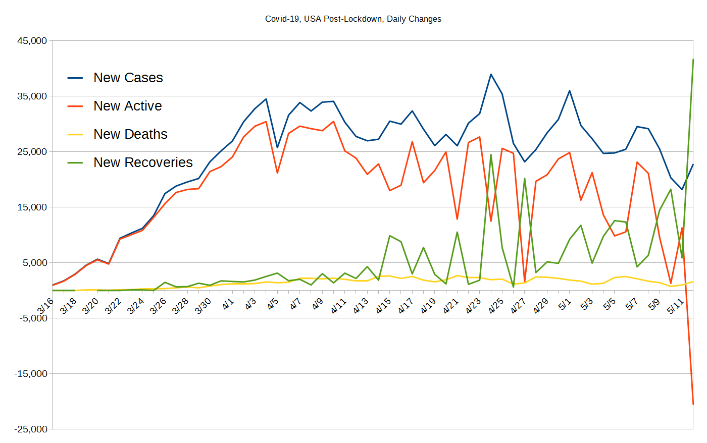
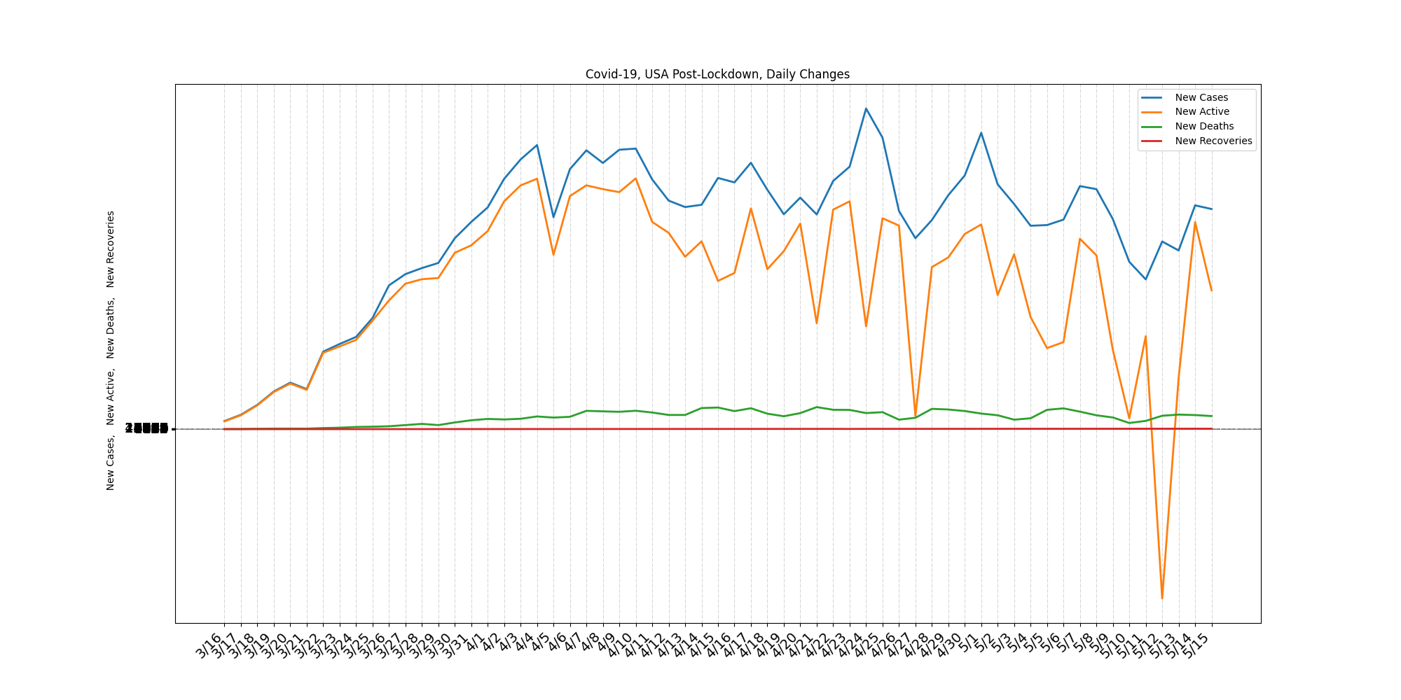
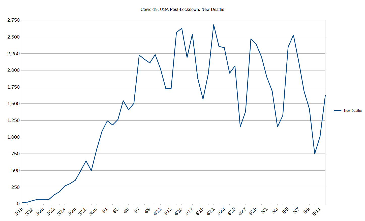
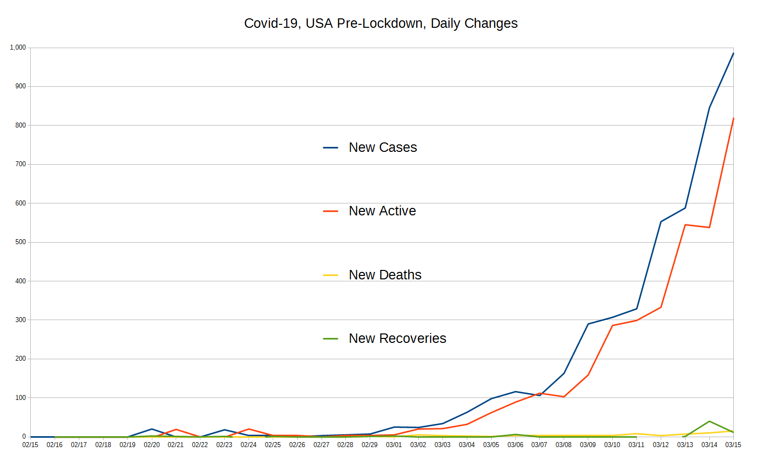
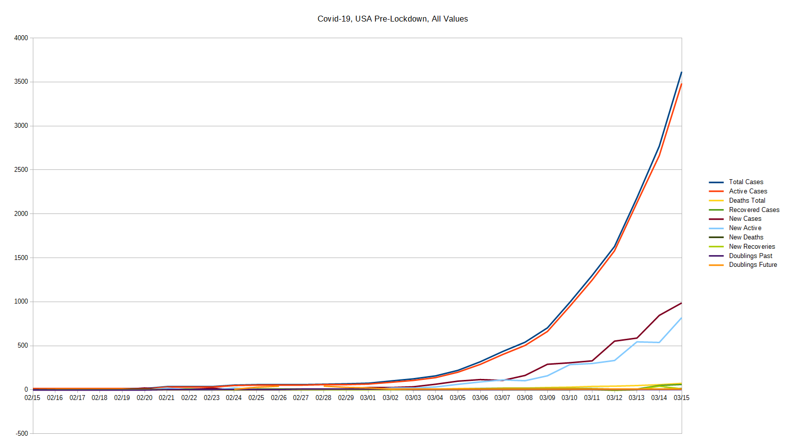
Third, over-processing data often ruins the data. Places that insist that lines must be smoothed out to stop the inherent jumpiness are in essence insisting on lying to their viewers. Instead, we think that seeing natural patterns is a part of what makes science interesting - such as picking up on the fact that nearly half of all health-care outlets don't do reporting on Sundays! So, the data jumps.
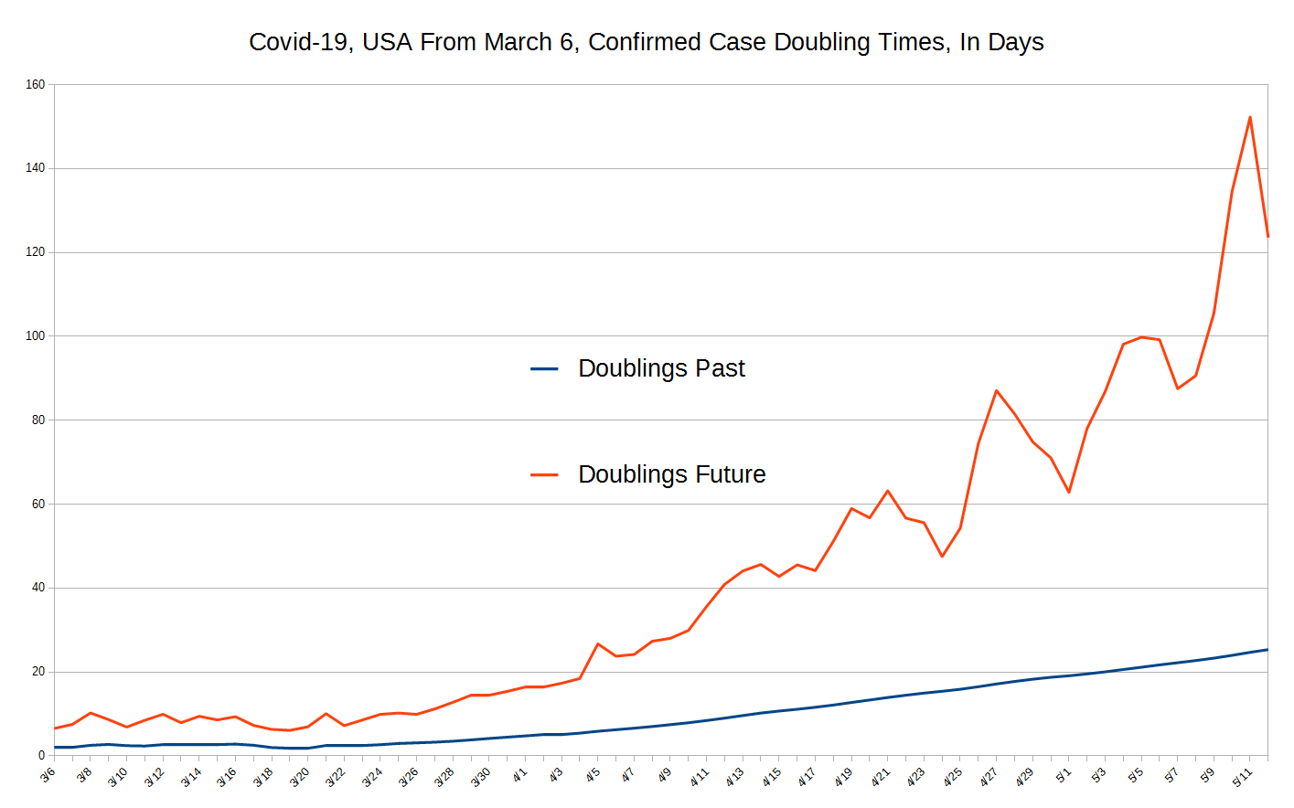
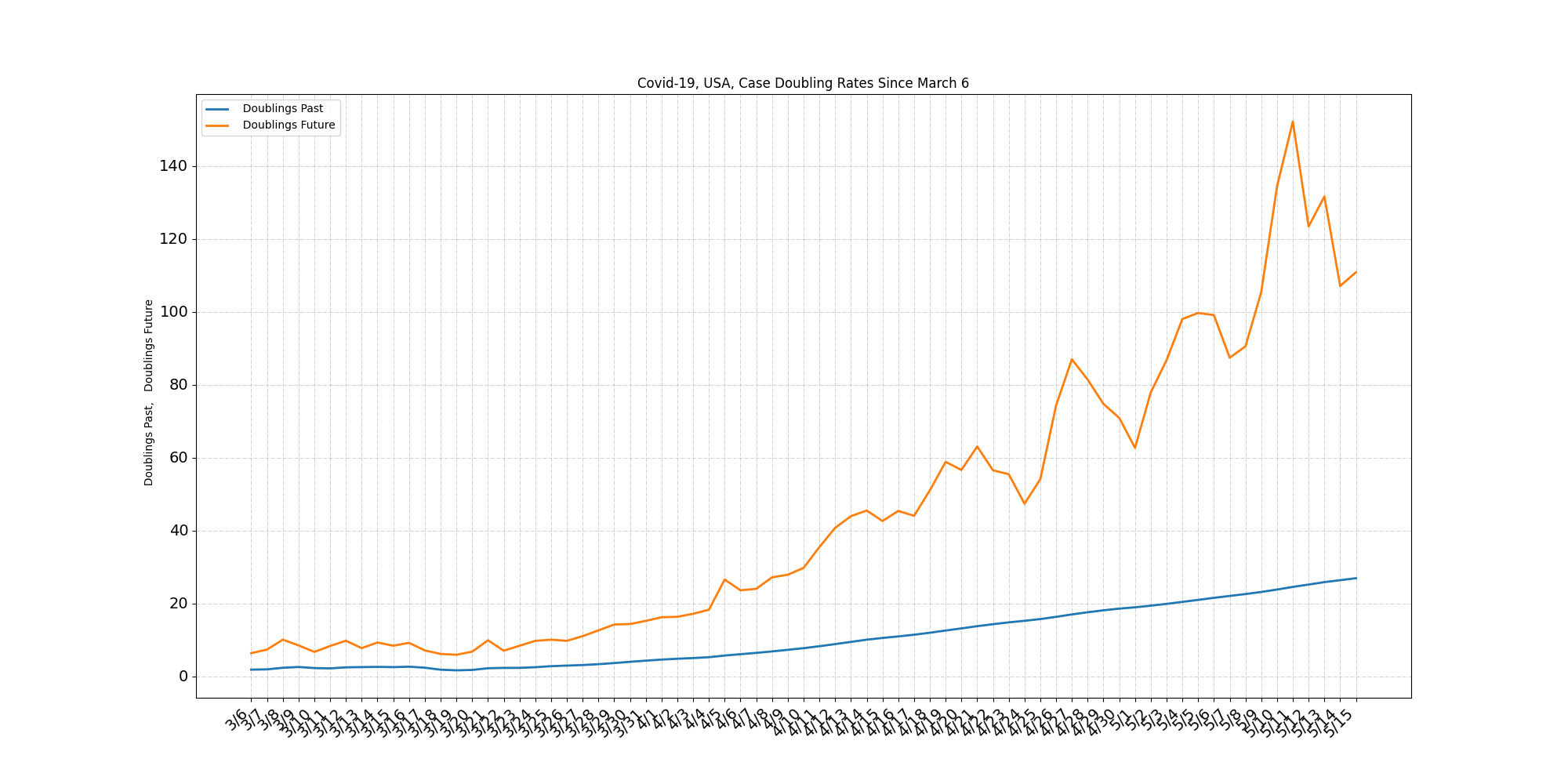
Fourth, we present data nobody else does, and we think it's very helpful data, simple though it may be. With our data you can see the changes in infection rates over time, which basically shows whether lockdown is helping or not. (And, of course it does!) Our work both quantifies and visualizes the effect lock-downs have had or are having.
Because we're an under-staffed volunteer organization, we know we can't support this into the future without appropriate automation. So, we wrote four automation tools to help keep the data up to date automatically and keep the quality high. You can read about our computer work here. It was a lot of work, but now we're hoping to use these tools to cover yet more states and perhaps even some other countries.
We invite you to contact us and tell us what you think, ask questions, and if you want to donate, click here. You can mail us and we've put a comment section below.
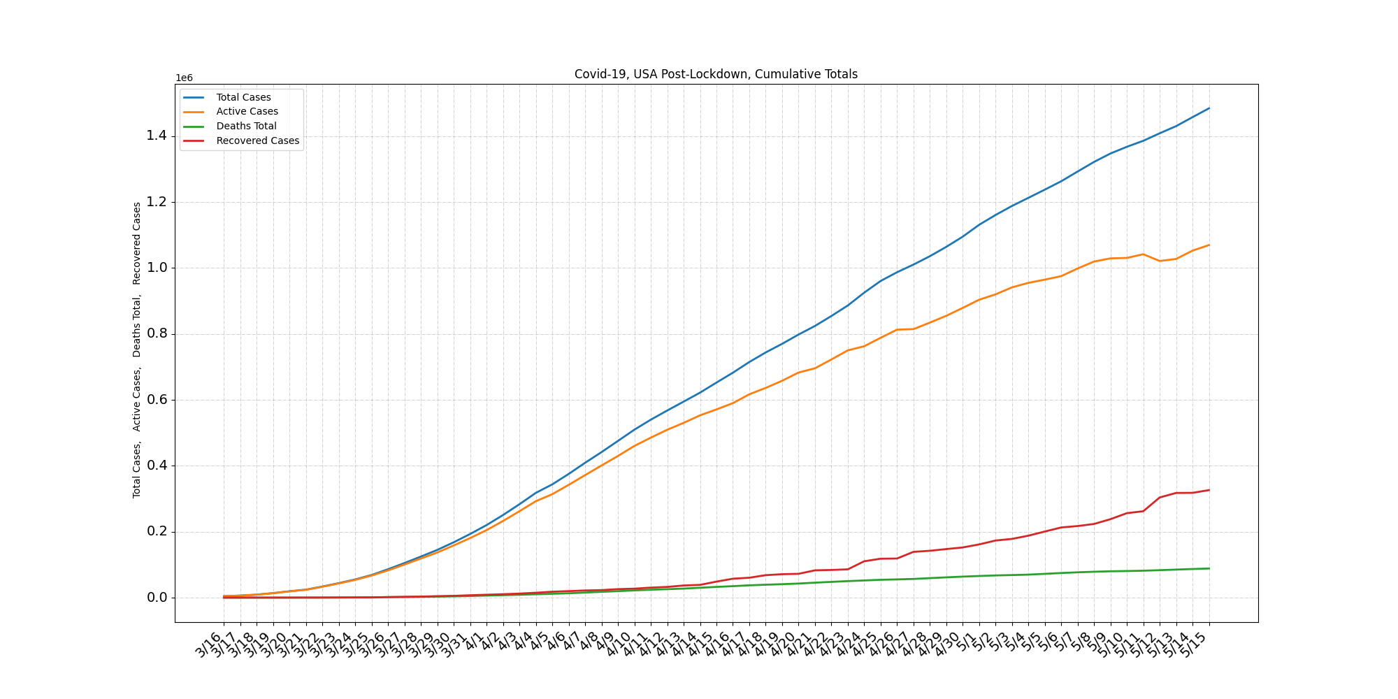
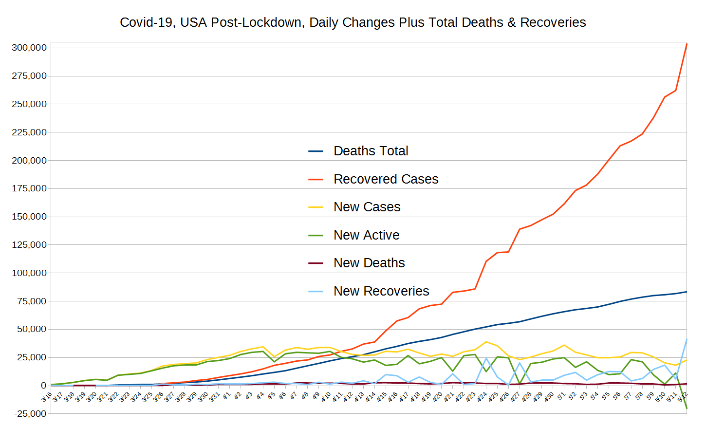
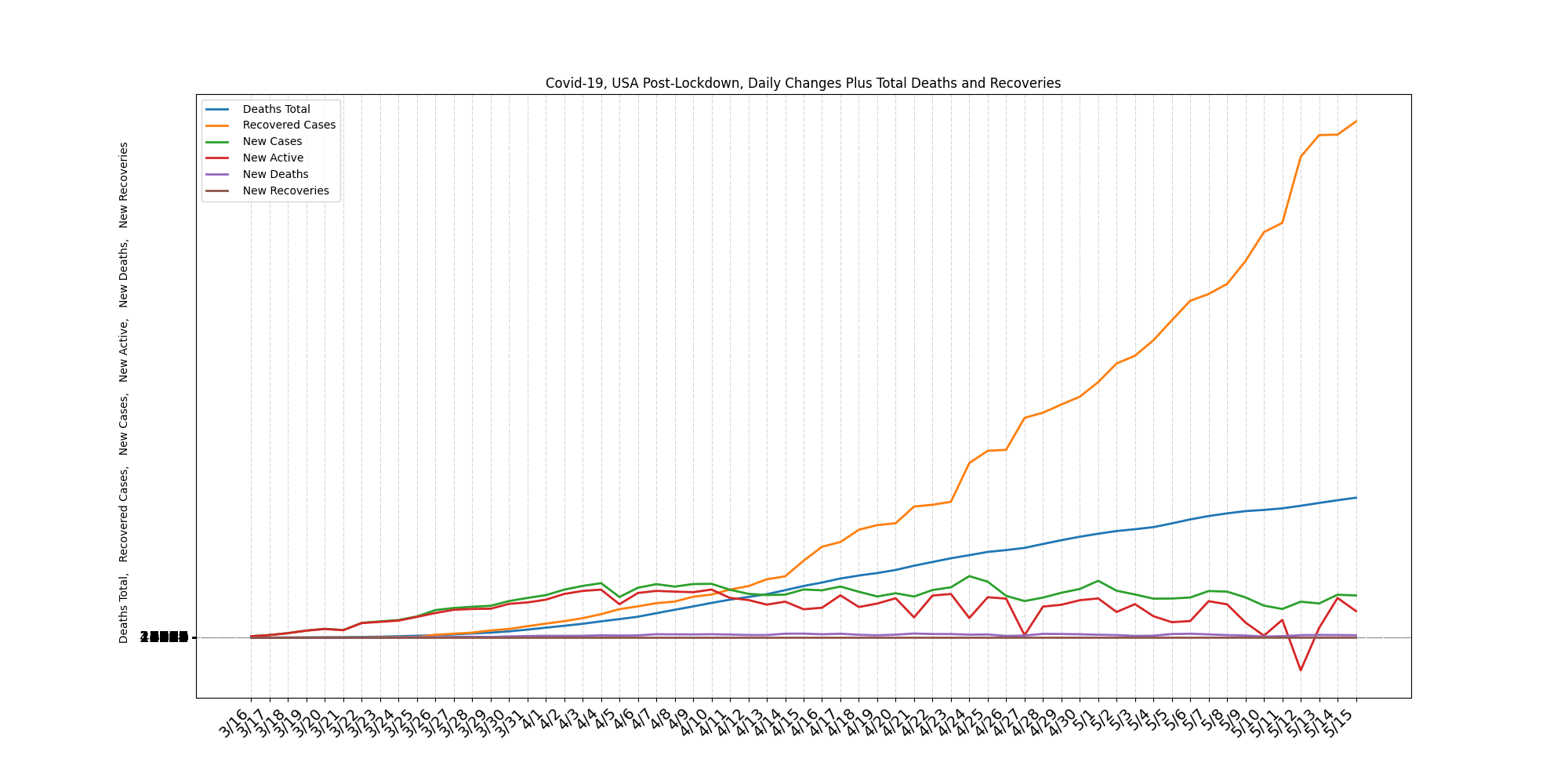
Our hand-made graphs are easier to read, but time-consuming to make, while our graphs made via automation are likely more up-to-date but harder to read becasue the automation software isn't as capable as the tools we use by hand.
See the graphs that change daily
with discussion of their meaning.
See Our Data-Processing Page,
with annotations and discussion.
CSV Format: These are smply "flat files" in the Comma Separated Value format. Note that the data is not perfect, so we explain the issues, how we have created these, our sources and techniques, etc, on this page. There, we also describe data we provide that nobody else does, that we know of.
First, we're concerned about the exit-from-lockdown and want to show how this is changing things via changes in the numbers. So, we've added ten states we hope are representatiave of the best and worst and also among the more interesting. As of this writing the data is all available on the site but the web pages that will present it aren't ready - still a lot of work to go, so we've made the auto-generated graphs available here and we've put the Comma Separated Value data here. We hope the file titles we've used make sense to you so you can choose from among these - let us know what you think in the comments below!
The last step is now underway; changing our web pages so that many of these graphs are ready for visualization by you, the public. Open the same graphs for different locations in different browser windows and compare! Again, let us know what you think in the comments below, or via email, etc.
Do let us know what you think or even make requests or ask questions! Please either comment below, email us, or perhaps donate to our cause.