Copyright © 2016 - 2025, The Troy Press

Copyright © 2016 - 2025, The Troy Press
Copyright © 2016 - 2025,
The Troy Press
This page is a part of our broader Covid-19 coverage:
We invite you to contact us and tell us what you think, and ask questions - what do you want to know that the media isn't telling you? We genuinely want to answer all good questions if we can. You can mail us, use our comment section on the main Covid-19 page. And as we are an all-volunteer team, if you want, you can make a donation.
New York's "Stay-at-home" was ordered March 22, and expires May 28.
The data shows the lockdown came too late and is largely responsible for the absolutely huge number of cases - that, and the forced close-proximity of how people live in NYC.
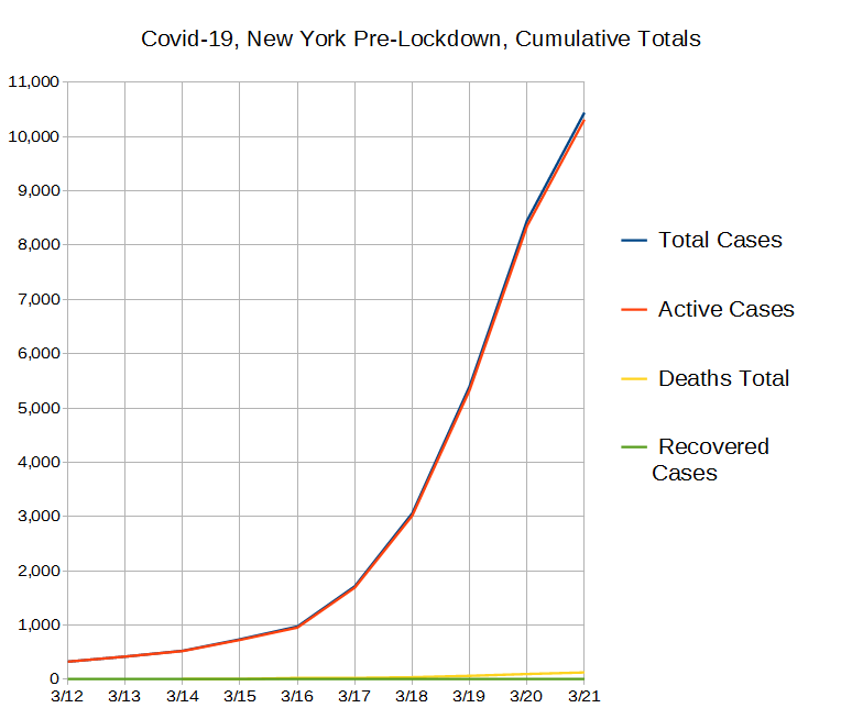
We're giving the pre-lockdown timeframe more attention for New York than we have for ther other states were're covering since it's clear from the data it was bungled at the start, but also that they seem to have things in hand now.
Hand-Made Graph At Right
Click here for
full size.
Click herefor
the Automated version.
Click here for
the data in
csv format.
Hand-Made in
full size.
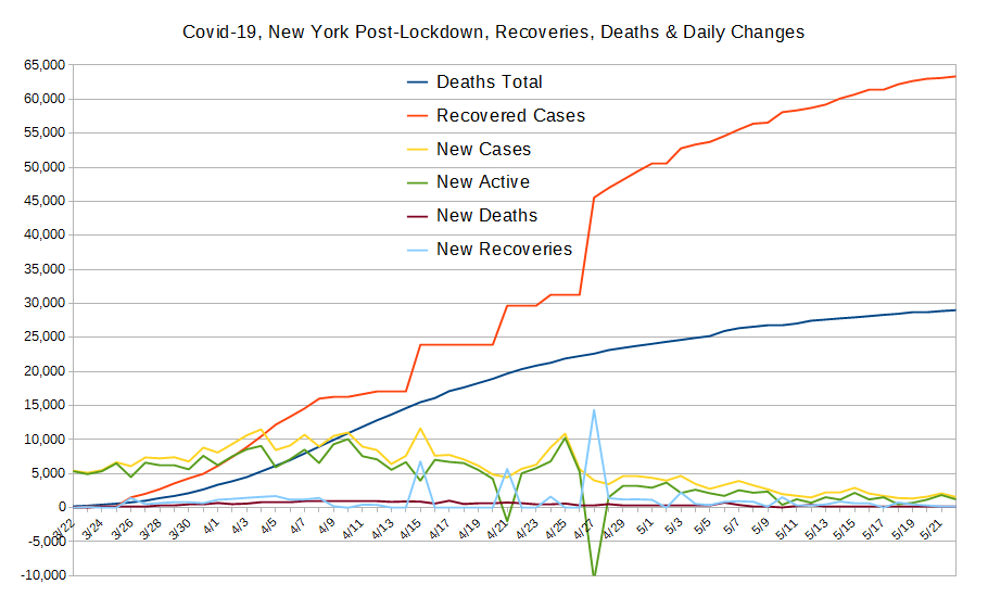
Since Lockdown Started
All of it.
The only of these to ever drop is the number of active cases, which is bound to go down some day. So, other than active cases, it's the rate of change that's important. Most of our other graphs are focused on showing you these changes in the right scale since here, any squiggle from one day to the next is pretty well lost to the eye.
So far, New York's experience is the worst we've seen, by far, and we think it's largely due to the "Stay-At-Home" order coming far too late.
When this data begins, on March 12, CA and NY had about the same number of cases but by the 16th, NY already had double the cases of CA. That should have told them something! In CA, the politicians were looking at the data and made a call to start lockdown on 3/16. By waiting until 3/21 to follow suit, NY gave itself a full order-of-magnitude worse case-load. Oops!
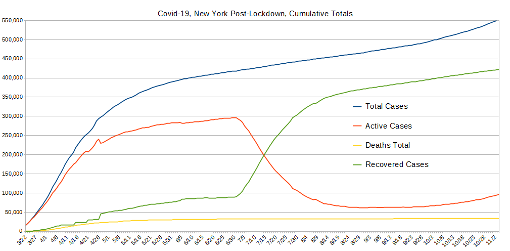
Today, CA has about 90,600 cases, about 69,900 of which are active while NY has about 368,000 cases of which about 276,000 are active. Sure, the population density matters, but so does acting fast. We grieve for our friends in New York - you have it worst of all of us in the US. The next graph, however, shows strong signs to belive the worst is behind them.
Hand-Made Graph At Right
Click here for
full size.
Click herefor
the Automated version.
Click here for
the data in
csv format.
Hand-Made in
full size.
Since Lockdown Started
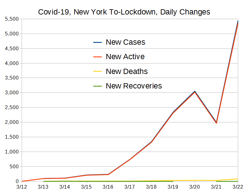
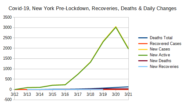
Pre-Lockdown
All of it.
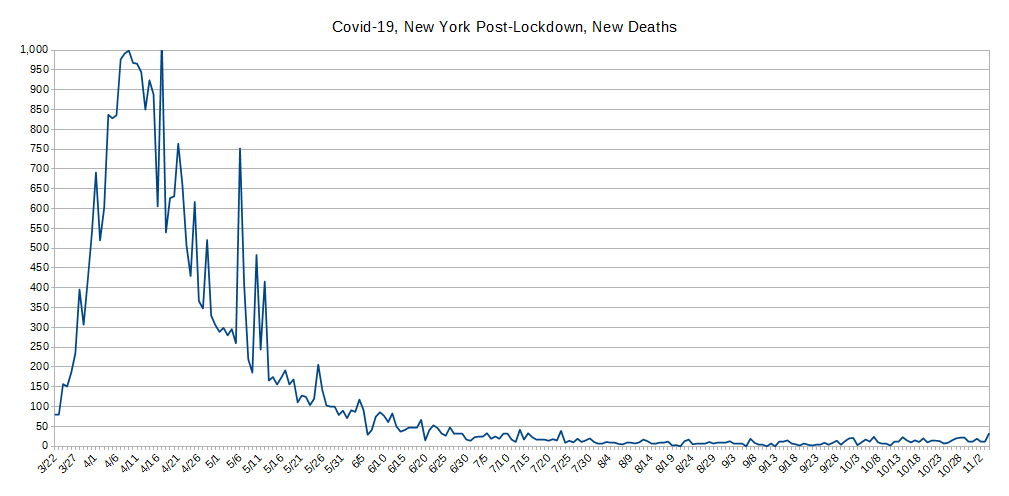
These data were created by taking the daily values for the data used to create the Totals graph above, and comparing with the previous day's value and computing the difference. New Cases and Newly Active cases closely match most of the time and this is because testing is nearly exclusively being done on those people who present themselves for health care. (And, folks, this is definitely "doing it wrong.") However, when people recover (or die), that also has an impact on the daily changes to the number of active cases, and therefore the change from one day to the next which drives how these data are collected.
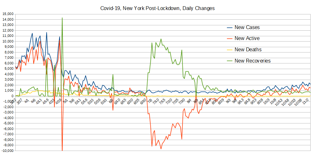
No other place we've graphed so far starts off in lockdown with as high a starting point for new and active cases, which is why, so far, this is the only location for which we've included the pre-lockdown new daily values as an on-screen graph. The data shows New York's worst period was about April 1 to around April 27, and today the new case-loads are very low, comparatively speaking.
That said, the data shows that the current new case load is very modest compared with what one might have expected. So, it just might be that they're over the worst now.
The huge negative spike in newly active cases along with a big spike in recoveries was a VERY notable occurance. The USA as a whole experienced a similar thing around May 12 while this was April 28. This is the kind of thing we're hoping to see in the numbers everwhere and a lot more frequently. Notably New York has a lot of cases still outstanding, so there's a lot more recoveries expected!
Hand-Made Graph At Right
Click here for
full size.
Click herefor
the Automated version.
Click here for
the data in
csv format.
Hand-Made in
full size.
The purpose of this graph is to show two values also shown on the "Totals" graph above with much better scaling. These are the total deaths and the total recovered cases.
The "New" lines are all shown with better scaling in the graph above, and are included here for better comparison with total recoveries and deaths.
We think New York is doing very well considering the rough start it had. Deaths has damned near stopped rising and all the new daily data is looking remarkably good, all things considered.
Hand-Made Graph At Right
Click here for
full size.
Click herefor
the Automated version.
Click here for
the data in
csv format.
Graphed "By-Hand".
This was broken out, again, for better scaling because the variation is simply lost at other scales.
Unlike most ohter states, New York's health care providers seem to be pretty good at reporting data reliably every day of the week, as can be seen when comparing this graph to other states like, say, Louisiana.
We happen to think this is a very remarkable graph for it illustrates both just how bad things were and how good things became; no ohter state shows such a steep increase in the death rate, and no other state shows such a sharp decrease in the death rate! Remarkable job, New York.
Hand-Made Graph At Right
Click here for
full size.
Click herefor
the Automated version.
Click here for
the data in
csv format.
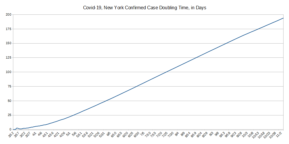
The concept behind "Case Doublings" is to try and get a handle on whether one is winning the war against a pandemic or not. It's driven by how many cases of confirmed infection are recorded. It's simple: From today, looking to the past, how long has it been since we had half as many cases as we have today? That is, today represents a doubling from what day in the past?
One can also look at it in a forward direction but the information isn't as useful beacuse it jumps around lot due to subtle variations in the day-to-day number of reported cases. And, that also tends to obscure the scale. In contrast, looking backwards always gives a stable line because the daily variations shown and discussed above aren't present.
The longer it takes for the number of cases to double, the better you're doing against the pandemic, and the CHANGE in the number of days indicates whether your current actions are helping or hurting. We also think a pertinent timescale is the average time of an infected person's disease to run its course to either recovery or death, presently believed to be about 21 days.
As one could guess, New Yorks initial infection rate on a week's scale was logrythmic. From March 15 and 16 doubling was stable but short, then it got worse for the next few days - this corresponds to the huge jump in cases seen in the data presented above. It was only when lockdown started that the doubling rate began to actually rise steadily. And this illustrates exactly why lockdowns are vital to addressing pandemics.
If the 21 day case-resolution timeframe is accurate, New York is presently at about double that, so its health-care facilities should be clearing out about now! Lets hust hope ending lockdown doesn't create another wave!
Do let us know what you think or even make requests or ask questions! Please either comment on our main Covid-19 page's comment section, email us, or perhaps, as we're an all volunteer team, donate to our cause.