Copyright © 2016 - 2021, The Troy Press

Copyright © 2016 - 2021, The Troy Press
Copyright © 2016 - 2021,
The Troy Press
This page is a part of our broader Covid-19 coverage:
We invite you to contact us and tell us what you think, and ask questions - what do you want to know that the media isn't telling you? We genuinely want to answer all good questions if we can. You can mail us, use our comment section on the main Covid-19 page. And as we are an all-volunteer team, if you want, you can make a donation.
Massachusetts' "State Of Emergency", began on March 10 and "became official" on March 24, but ended on May 18. For our purposes here, we consider "lockdown" began on March 10 because that's when the reaction began.
Hand-Made Graph At Right
Click here for
full size.
Click herefor
the Automated version.
Click here for
the data in
csv format.
There was literally no data. Massachusetts needs to be commended for acting FAR earlier than most any other state. In fact, we may alter our reporting because of this since it compresses the graphs! We might pick a new date to start our "post-lockdown" coverage on!
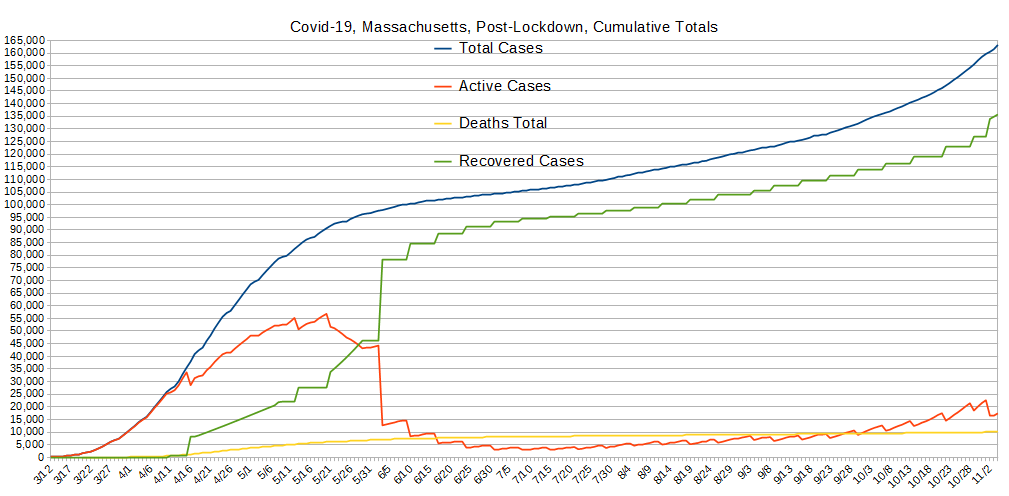
The only of these to ever drop is the number of active cases, which is bound to go down some day. So, other than active cases, it's the rate of change that's important. Most of our other graphs are focused on showing you these changes in the right scale since here, any squiggle from one day to the next is pretty well lost to the eye.
The big shift in Active Cases and Recoveries is pretty consistent with what we think are the normal recovery times for Covid-19 patients - about 3 weeks. It's either that, by then, or they're dead, though this 3 week timeline is in some dispute. However, HERE, the data shows a significant number of recoveries at around two weeks, and this is important data.
Hand-Made Graph At Right
Click here for
full size.
Click herefor
the Automated version.
Click here for
the data in
csv format.
Massachusetts locked down so early, there's nothing to graph.
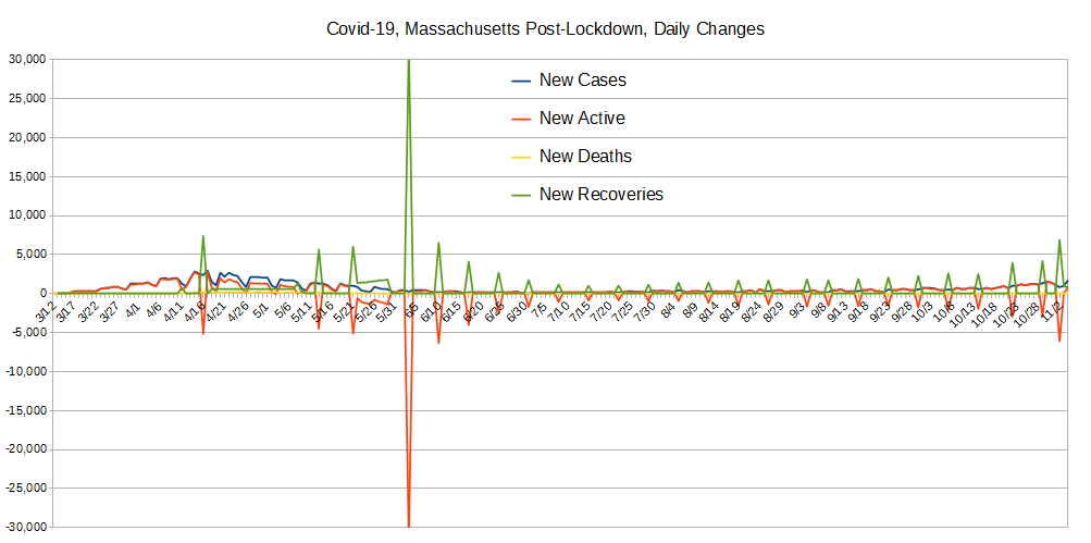
These data were created by taking the daily values for the data used to create the Totals graph above, and comparing with the previous day's value and computing the difference. New Cases and Newly Active cases closely match most of the time and this is because testing is nearly exclusively being done on those people who present themselves for health care. (And, folks, this is definitely "doing it wrong.") However, when people recover (or die), that also has an impact on the daily changes to the number of active cases, and therefore the change from one day to the next which drives how these data are collected.
The huge negative spikes in newly active cases along with big spikes in recoveries are VERY notable occurances. The USA as a whole experienced a similar thing around May 12 while this was later. This is the kind of thing we're hoping to see in the numbers everwhere and a lot more frequently. NOTABLY, there's a big spike like that when this grap was made. Let's hope that continues!
Hand-Made Graph At Right
Click here for
full size.
Click herefor
the Automated version.
Click here for
the data in
csv format.
Massachusetts locked down so early, there's nothing to graph.
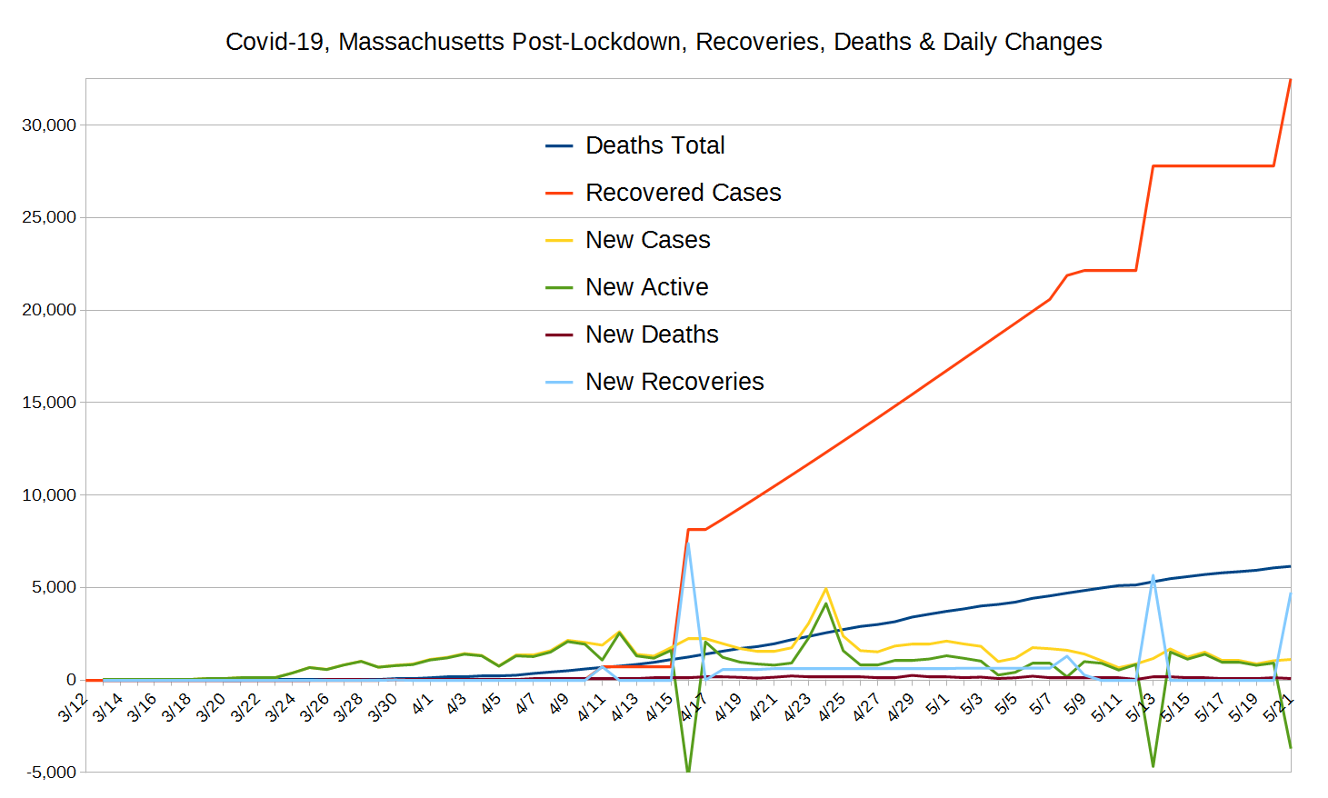
The purpose of this graph is to show two values also shown on the "Totals" graph above with much better scaling. These are the total deaths and the total recovered cases.
All the graphs show daily changes that influence the Totals we present at top, but few of them are so clean of noise to illustrate what we see here.
Here, we see the blue "New Recoveries" line's influence on the total of Recovered Cases very clearly. The big shift begins at the first large spike, and then the modest but significantly non-zero value for New Recoveries supports the 45 degree or so line in the increase of Recovered Cases, with commensurate bumps when there are big spikes, negative and positive, in New Active and New Recoveries, respectively.
Hand-Made Graph At Right
Click here for
full size.
Click herefor
the Automated version.
Click here for
the data in
csv format.
Massachusetts locked down so early, there's nothing to graph. The number was too small to warrant graphing.
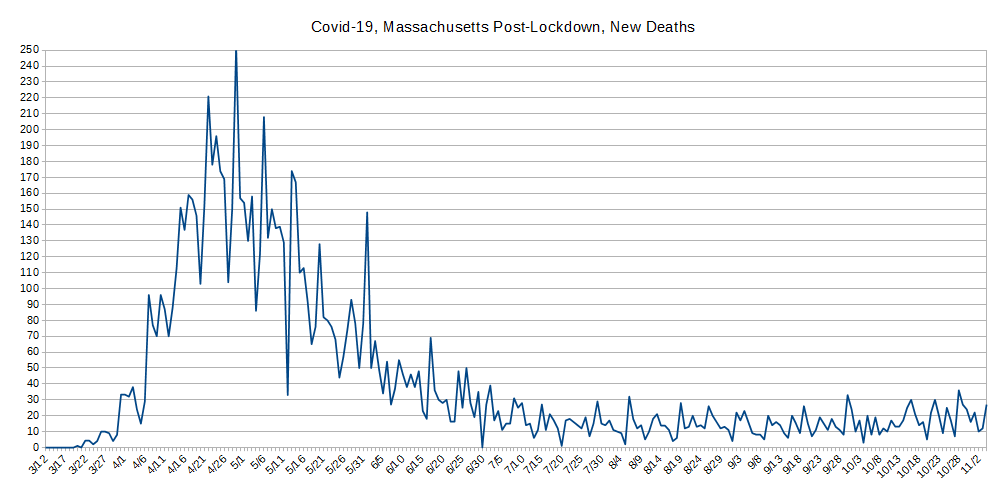
This was broken out, again, for better scaling because the variation is simply lost at other scales.
This graph illustrates that Massachusetts peaked around the 28th or so of April, and today is around the roughly half the value numbers from the end of the second week of April, and trending downward. WAY TO GO, Massachusetts! Notably, this curve looks very similar to the one for the whole USA.
One interesting thing to observe here are the sharp down-peaks to a pretty consistent value. The down values represent health-care organizations that don't report on Sundays!
Hand-Made Graph At Right
Click here for
full size.
Click herefor
the Automated version.
Click here for
the data in
csv format.
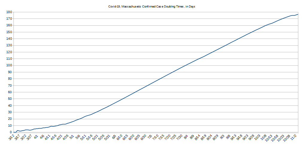
The concept behind "Case Doublings" is to try and get a handle on whether one is winning the war against a pandemic or not. It's driven by how many cases of confirmed infection are recorded. For any given day, there are two questions to be answered:
Looking backwards always gives a stable line because the daily variations shown and discussed above aren't present.
The longer it takes for the number of cases to double, the better you're doing against the pandemic, and the CHANGE in the number of days indicates whether your current actions are helping or hurting.
Troublingly, the doubling time DROPPED until a low of March 25, which strongly suggests the Massachusetts' State Of Emergency declaration was extremely insightful, coming some several days before the worst-case doubling time they actually experienced on, literally THE day after they "made it official."
Where things stand in MA as of this writing is that the doubling rate is only just at the time period we think MAYBE is the normal course for Covid-19 to lead to either recovery or death. So, at this point, if things remain stable, Massachusetts will be filling its health-care wards about as fast as it's emptying them - it could be worse, but we're not talking about "beating the curve" just yet.
Do let us know what you think or even make requests or ask questions! Please either comment on our main Covid-19 page's comment section, email us, or perhaps, as we're an all volunteer team, donate to our cause.