Copyright © 2016 - 2025, The Troy Press

Copyright © 2016 - 2025, The Troy Press
Copyright © 2016 - 2025,
The Troy Press
This page is a part of our broader Covid-19 coverage:
We invite you to contact us and tell us what you think, and ask questions - what do you want to know that the media isn't telling you? We genuinely want to answer all good questions if we can. You can mail us, use our comment section on the main Covid-19 page. And as we are an all-volunteer team, if you want, you can make a donation.
Pennsylvania's "Stay-at-home" was ordered March 22, and expires May 29.
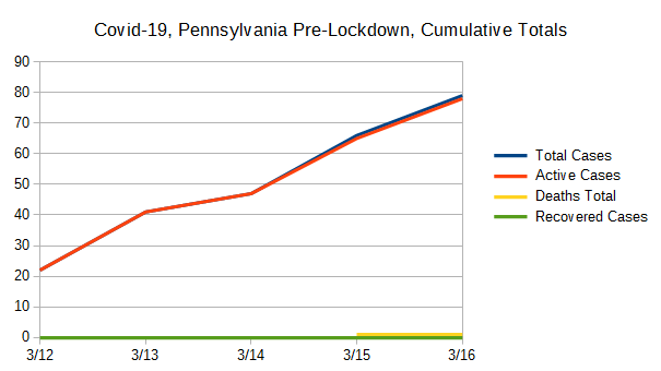
Hand-Made Graph At Right
Click here for
full size.
Click herefor
the Automated version.
Click here for
the data in
csv format.
Hand-Made in
full size.
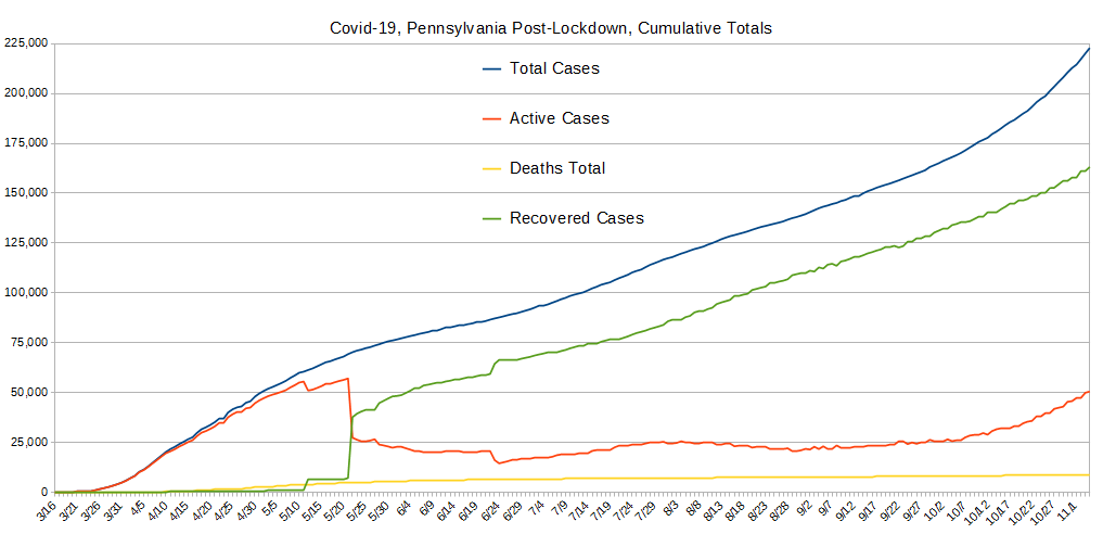
The only of these to ever drop is the number of active cases, which is bound to go down some day. So, other than active cases, it's the rate of change that's important. Most of our other graphs are focused on showing you these changes in the right scale since here, any squiggle from one day to the next is pretty well lost to the eye.
This graph suggests Pennsylvania's case-resolution time is an atounding 38 days, which is what we have to believe if we are to take the reporting on May 12 at face value. And even if we do, the later reporting on May 22 remains puzzling since not everybody got infected at the same time.
We're wondering how it could be that PA has the greatest number of recoveries in a single day ever recorded. We surmise it's because they haven't been reporting their numbers properly and then suddenly did, but who knows? Either way, it's a welcome thing to see 29680 recoveries in a single day!
Hand-Made Graph At Right
Click here for
full size.
Click herefor
the Automated version.
Click here for
the data in
csv format.
Hand-Made in
full size.
Since Lockdown Started
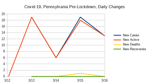
Pre-Lockdown
All of it.
These data were created by taking the daily values for the data used to create the Totals graph above, and comparing with the previous day's value and computing the difference. New Cases and Newly Active cases closely match most of the time and this is because testing is nearly exclusively being done on those people who present themselves for health care. (And, folks, this is definitely "doing it wrong.") However, when people recover (or die), that also has an impact on the daily changes to the number of active cases, and therefore the change from one day to the next which drives how these data are collected.


We are delighted about The Great Recovery, but the huge swings up and down really destroy the graph's usefulness for anything else, so we re-did it. Get it full size here.
From this second graph, PA's experience seems to have been improving lately, with a bad period from the second week of april until about May 12. Oh, and note that PA's great May 12 also joins up with another big recovery day that day in other states contributing to a big spike for the nation as a whole.
Hand-Made Graph At Right
Click here for
full size.
Click herefor
the Automated version.
Click here for
the data in
csv format.
Hand-Made in
full size.
Since Lockdown Started
Pre-Lockdown
All of it.
The purpose of this graph is to show two values also shown on the "Totals" graph above with much better scaling. These are the total deaths and the total recovered cases.
Notably, the big negative spike for Active Cases being precisely timed with the big spike in recoveries illustrates the point made above about "New Active" really meaning "new changes to the currently active cases," and so it can go negative as it does here when there's a larger number of recoveries (and deaths) than new infections.
The "New" lines are all shown with better scaling in the graph above, and are included here for better comparison with total recoveries and deaths.
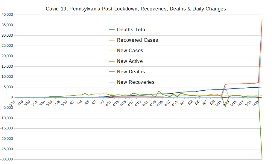
As with the graph above, The Great Recovery ruins the scale for seeing other detail for most things, but here, it's OK, because we clearly see how the ONLY two significant recovery periods shot up PA's recovery numbers, which are otherwise abysmal. (Note how the down spikes exactly match the up spikes! That's because "New Active" really means new changes to the number of currently active cases, and when recoveries and deaths overwhelm new cases, the number goes negative. The negative numbers show beating the pandemic!)
Hand-Made Graph At Right
Click here for
full size.
Click herefor
the Automated version.
Click here for
the data in
csv format.
Graphed "By-Hand".
Since Lockdown Started
Pre-Lockdown
All of it.
This was broken out, again, for better scaling because the variation is simply lost at other scales.
As seen in most states, there's an absense of reporting deaths on Sundays by some health-care providers, and that's just where all the down-spikes are.
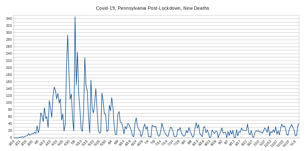
This graph shows data that's not as hopeful as we'd like. Given other factors noted above, we're likely to see a steady rate of deaths for a while yet, even if new infections is brought under control.
Hand-Made Graph At Right
Click here for
full size.
Click herefor
the Automated version.
Click here for
the data in
csv format.
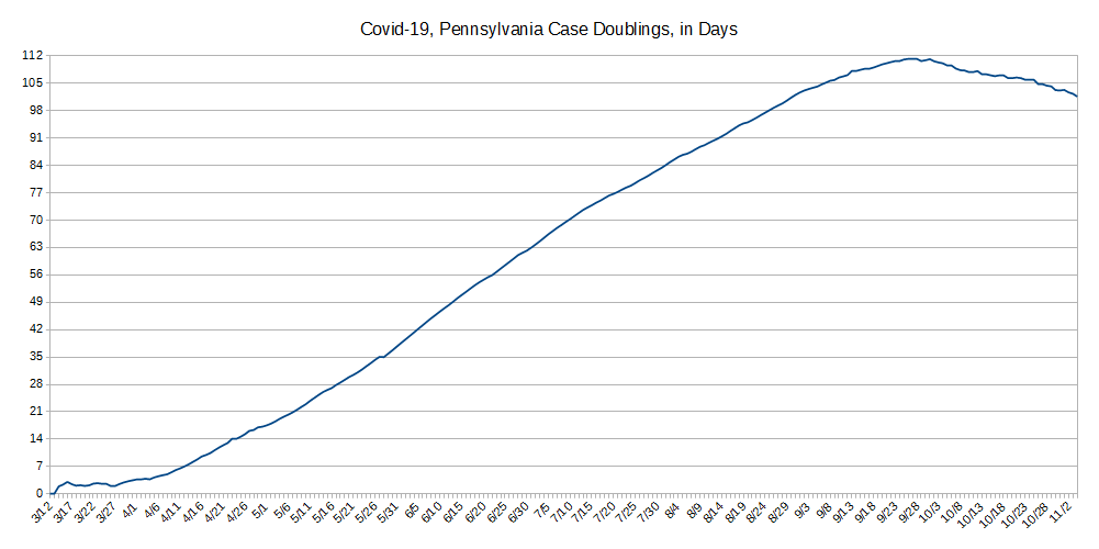
The concept behind "Case Doublings" is to try and get a handle on whether one is winning the war against a pandemic or not. It's driven by how many cases of confirmed infection are recorded. It's simple: From today, looking to the past, how long has it been since we had half as many cases as we have today? That is, today represents a doubling from what day in the past?
One can also look at it in a forward direction but the information isn't as useful beacuse it jumps around lot due to subtle variations in the day-to-day number of reported cases. And, that also tends to obscure the scale. In contrast, looking backwards always gives a stable line because the daily variations shown and discussed above aren't present.
The longer it takes for the number of cases to double, the better you're doing against the pandemic, and the CHANGE in the number of days indicates whether your current actions are helping or hurting. We also think a pertinent timescale is the average time of an infected person's disease to run its course to either recovery or death, presently believed to be about 21 days.
Unlike most all other states, amazingly, this data shows PA ignored the lockdown for a long time - 11 days. The doubling times actually got worse (lower) right after the lockdown was declared!
The early waviness of the line, basically horizontal, illustrates how PA wasn't taking this seriously at first. Things began to improve after March 27, but not by that much, then improved more, and consistently, starting April 4th. From there, the several wavers in the line have likely been caused by individual public events that got people sick.
We suspect people are tired of lockdown there and are violating it, and the result is new cases.
At this point, we can give PA a marginal grade on its performance today. The doubling time is still far below the doubling times of places that consider this pandemic a threat.
Do let us know what you think or even make requests or ask questions! Please either comment on our main Covid-19 page's comment section, email us, or perhaps, as we're an all volunteer team, donate to our cause.