Copyright © 2016 - 2025, The Troy Press

Copyright © 2016 - 2025, The Troy Press
Copyright © 2016 - 2025,
The Troy Press
This page is a part of our broader Covid-19 coverage:
We invite you to contact us and tell us what you think, and ask questions - what do you want to know that the media isn't telling you? We genuinely want to answer all good questions if we can. You can mail us, use our comment section on the main Covid-19 page. And as we are an all-volunteer team, if you want, you can make a donation.
Washington entered State-wide Lockdown March 23 which ends May 31.
Hand-Made Graph At Right
Click here for
full size.
Click herefor
the Automated version.
Click here for
the data in
csv format.
Hand-Made in
full size.
Since Lockdown Started
All of it.
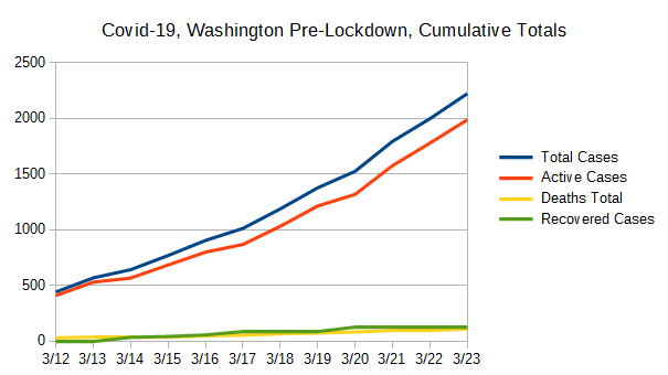
The only of these to ever drop is the number of active cases, which is bound to go down some day. So, other than active cases, it's the rate of change that's important. Most of our other graphs are focused on showing you these changes in the right scale since here, any squiggle from one day to the next is pretty well lost to the eye.
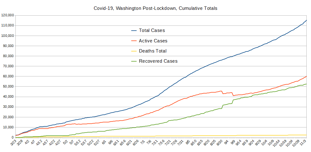
Without double checking Washington's population demographics, the state looks to be doing quite reasonably. This graph shows the infection rate - new cases adding to the total - is slowing. And, vitally, the separation of Active Cases and corresponding uplift in Recoveries puts the state ahead of many.
Hand-Made Graph At Right
Click here for
full size.
Click herefor
the Automated version.
Click here for
the data in
csv format.
Hand-Made in
full size.
Since Lockdown Started
Pre-Lockdown
All of it.
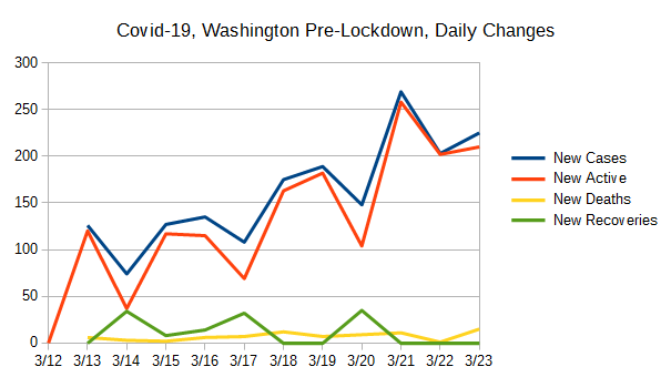
These data were created by taking the daily values for the data used to create the Totals graph above, and comparing with the previous day's value and computing the difference. New Cases and Newly Active cases closely match most of the time and this is because testing is nearly exclusively being done on those people who present themselves for health care. (And, folks, this is definitely "doing it wrong.") However, when people recover (or die), that also has an impact on the daily changes to the number of active cases, and therefore the change from one day to the next which drives how these data are collected.
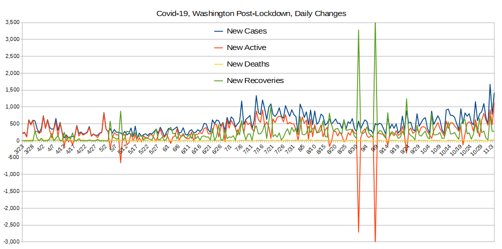
Again, this graph shows Washington doing pretty well. While the early period had some substantial new cases, they had substantial recoveries from as early as the end of March. This was follwed by more, and finally, by around the end of the second week of April had repeated recoveries surpassing new cases enough to go negative repeatedly for about a week. This strong recovery response vs new cases is unusual.
Unfortunately, it took several more weeks for them to repeat that experience, but after May fifth , they've had this occur every few days, which is very healthy! To be clear, when the orange line here goes below zero, it means recoveries are more numerous than new confirmed cases and this is vital for beating the pandemic.
Hand-Made Graph At Right
Click here for
full size.
Click herefor
the Automated version.
Click here for
the data in
csv format.
Hand-Made in
full size.
Since Lockdown Started
Pre-Lockdown
All of it.
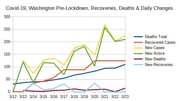
The purpose of this graph is to show two values also shown on the "Totals" graph above with much better scaling. These are the total deaths and the total recovered cases.

Here, this graph is intended to help correlate some data with other data at a scale that makes sense. But, as happens sometimes with various states, one metric dominates others so graphs don't tell you as much as they were intended to. This is one of those times.
That said, we note that Washintgon has a robust Recovery Rate, shown here as Recovered Cases. Unfortunately, their death rate is also climbing steadily, though looking at it this way doesn't tell you much. And so, we direct your attention to the next graph below.
Hand-Made Graph At Right
Click here for
full size.
Click herefor
the Automated version.
Click here for
the data in
csv format.
Graphed "By-Hand".
Since Lockdown Started
Pre-Lockdown
All of it.
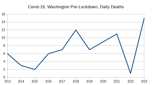
This was broken out, again, for better scaling because the variation is simply lost at other scales.
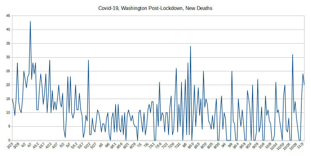
We hope the huge spikes in deaths reported on April 7, and May 21 were just reporting anomallies - perhaps, say, from their prison system or something like that. If so, then Washington is doing pretty well, overall with a nicely declining rate of deaths. Otherwise, that spike on the right is troubling.
As seen in most states, there's an absense of reporting deaths on Sundays by some health-care providers, and that's just where all the down-spikes are.
Hand-Made Graph At Right
Click here for
full size.
Click herefor
the Automated version.
Click here for
the data in
csv format.
The concept behind "Case Doublings" is to try and get a handle on whether one is winning the war against a pandemic or not. It's driven by how many cases of confirmed infection are recorded. It's simple: From today, looking to the past, how long has it been since we had half as many cases as we have today? That is, today represents a doubling from what day in the past?
One can also look at it in a forward direction but the information isn't as useful beacuse it jumps around lot due to subtle variations in the day-to-day number of reported cases. And, that also tends to obscure the scale. In contrast, looking backwards always gives a stable line because the daily variations shown and discussed above aren't present.
The longer it takes for the number of cases to double, the better you're doing against the pandemic, and the CHANGE in the number of days indicates whether your current actions are helping or hurting. We also think a pertinent timescale is the average time of an infected person's disease to run its course to either recovery or death, presently believed to be about 21 days.
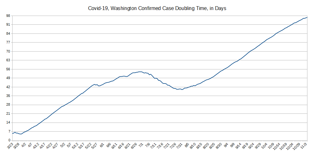
The data starts out showing us a small wave in the doubling time, and getting shorter - going the wrong way - for a week after lockdown, and then things begin to improve.
This illustrates many didn't take it seriously at first, as we see as statistically significant with some states and not others. But once things caught on, things have gone pretty smoothly, but...
Very interestingly, there's a small but noticeable peturbation in the data every two weeks. Clearly this is some group somewhere that decides they're going to meet anyway and some get infected and it shows up in the numbers. These people are putting people's lives at risk. But obviously they don't care, even though it's members of their own group and their families that are at most risk. ... Well, isn't that typical of humanity for you?
Do let us know what you think or even make requests or ask questions! Please either comment on our main Covid-19 page's comment section, email us, or perhaps, as we're an all volunteer team, donate to our cause.