Copyright © 2016 -2026, The Troy Press

Copyright © 2016 -2026, The Troy Press
Copyright © 2016 -2026,
The Troy Press
We've created this page because we've gotten feedback that many people, even very technical people, just don't understand why we say in our opening materials that "scale matters." They're not sure how to understand our criticism of some other sites for having bad scale.
It's worth pointing out that the concepts under discussion here apply to most all forms of visualization of data, whether we call them charts or graphs, and so forth, though there are some limits. For example, it might be reasonable to call seeing a living creature a visualization of the data of that creatures DNA, but obviously that's a bit beyond what we're talking about here.
The meaning of scaling is of course a derrived form of the root word "scale," originally a device used to weigh materials for market. Since that time, the word has developed new uses, such as for a measuement system - the Farenheit scale, for example.
When used in visualization systems like charts & graphs, scale is the collection of display attributes that determine not only the range of permissible values but also the resolution at which one can readily discern detail within the data presented.
As one zooms in or out to see any particular fascet of detail, other ranges go "out of focus", and, just as with optical systems, like telescopes and microscopes, this is unavoidable. Of course, one can get creative in combining graphs, but here we're talking about your basic graph, whether it be a line graph, bar graph, pie chart or what have you.
In our own work here, there are graphs that have the same data on them as other graphs, and in some graphs you can see detail that you cannot see in other graphs. And this is the whole point we're trying to make. So, here are some examples in which you can see the impact scale has.
We'll leave you with one further example. The one below has ALL the data from BOTH of the other two! But, notice once again how scale makes some of the data seem to disappear. As we said:
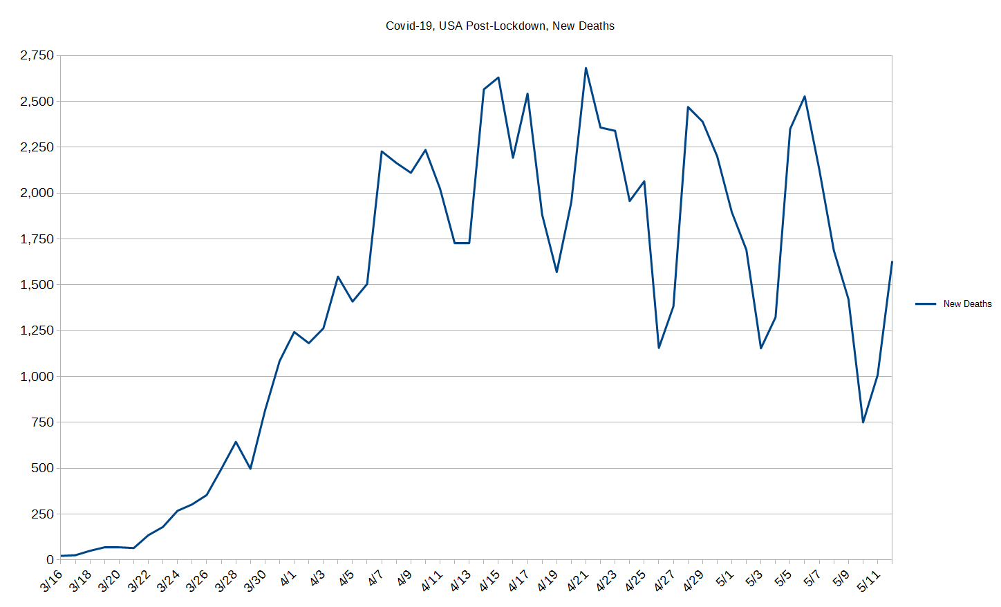
The graph above is presented at a scale where you can see all the data it realistically has to offer you. And, there's no wasted space anywhere.
ALL this same data is in the graph below. See if you can find out which colored line it is without looking at the legend! Can you?
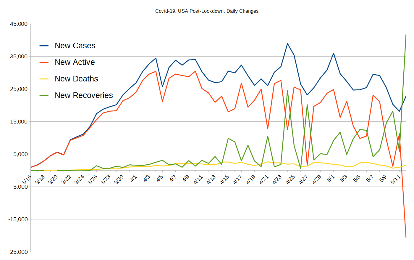
Did you find which colored line in the second graph has the same data as the first? YES! It is of course the yellow line! Does this make the point about WHY scale choices matter so much?
By the way, the second graph is great becasue it shows the dance of all four of the data sets pretty well as all four lines have an interlocked relationship, and the data from the first graph shouldn't have been left out - even though you can't see its scale well - because it's the combination of recoveries and deaths that so influences "New Active" and sometimes drives it negative. This may be confusing, perhaps, because it's name has been shortened for practical purposes - it's the "New Daily Changes To Active Cases", and it absolutely must go negative for us to exit this pandemic!

We invite you to contact us and tell us what you think, ask questions, and if you want to donate, click here. You can mail us and we have a Covid-19 comment section.